the blue-eyed barbarian:
Denys Putilin, Olena Kvitkovska
Sector:
Functional art
Website:
williamguillon.com
What we did:
Creative Direction
Website Design & Development
Year:
2026
Fonts:
Hurme Geometric Sans by Hurme Design
Client and the challenge:
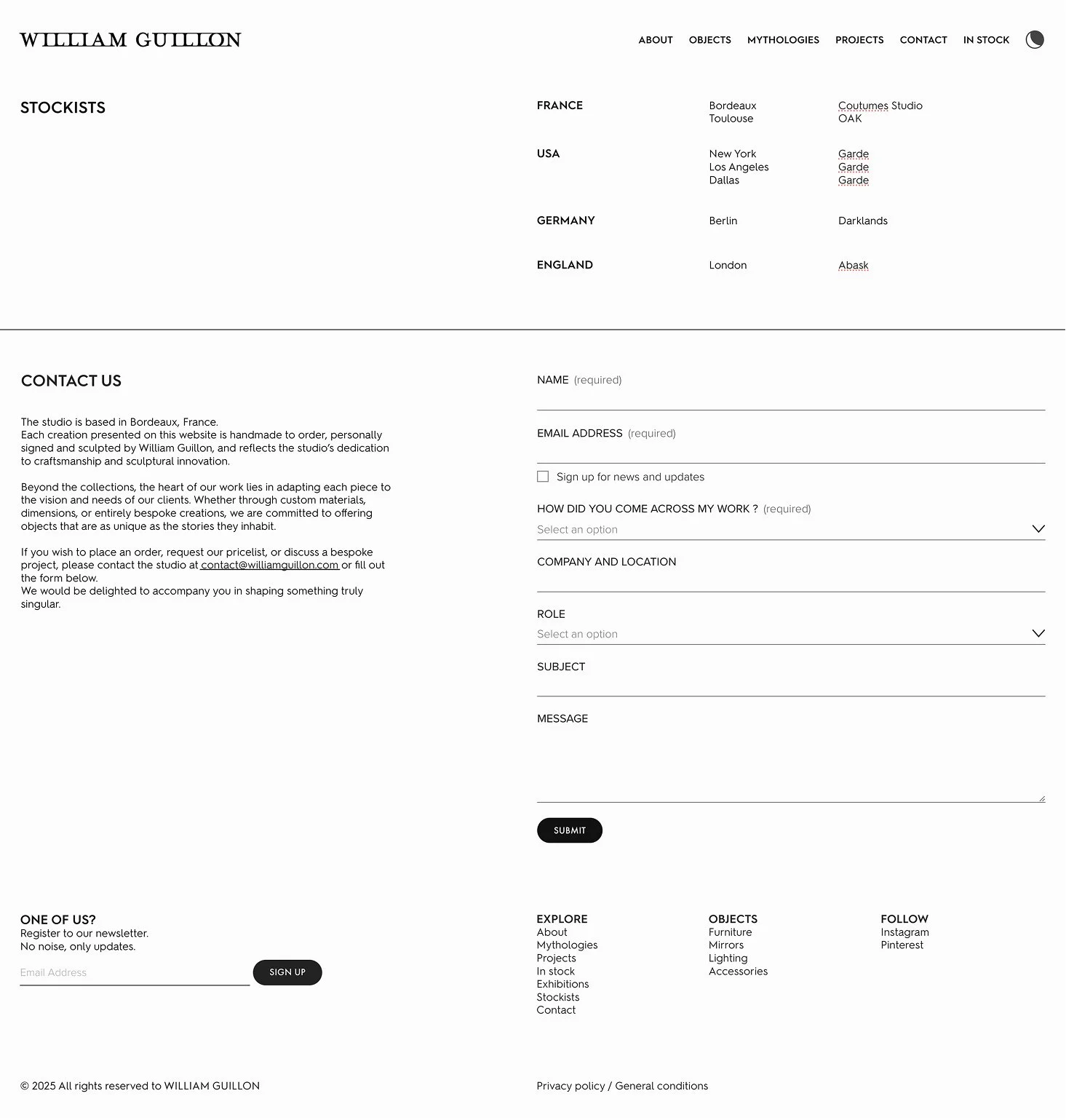
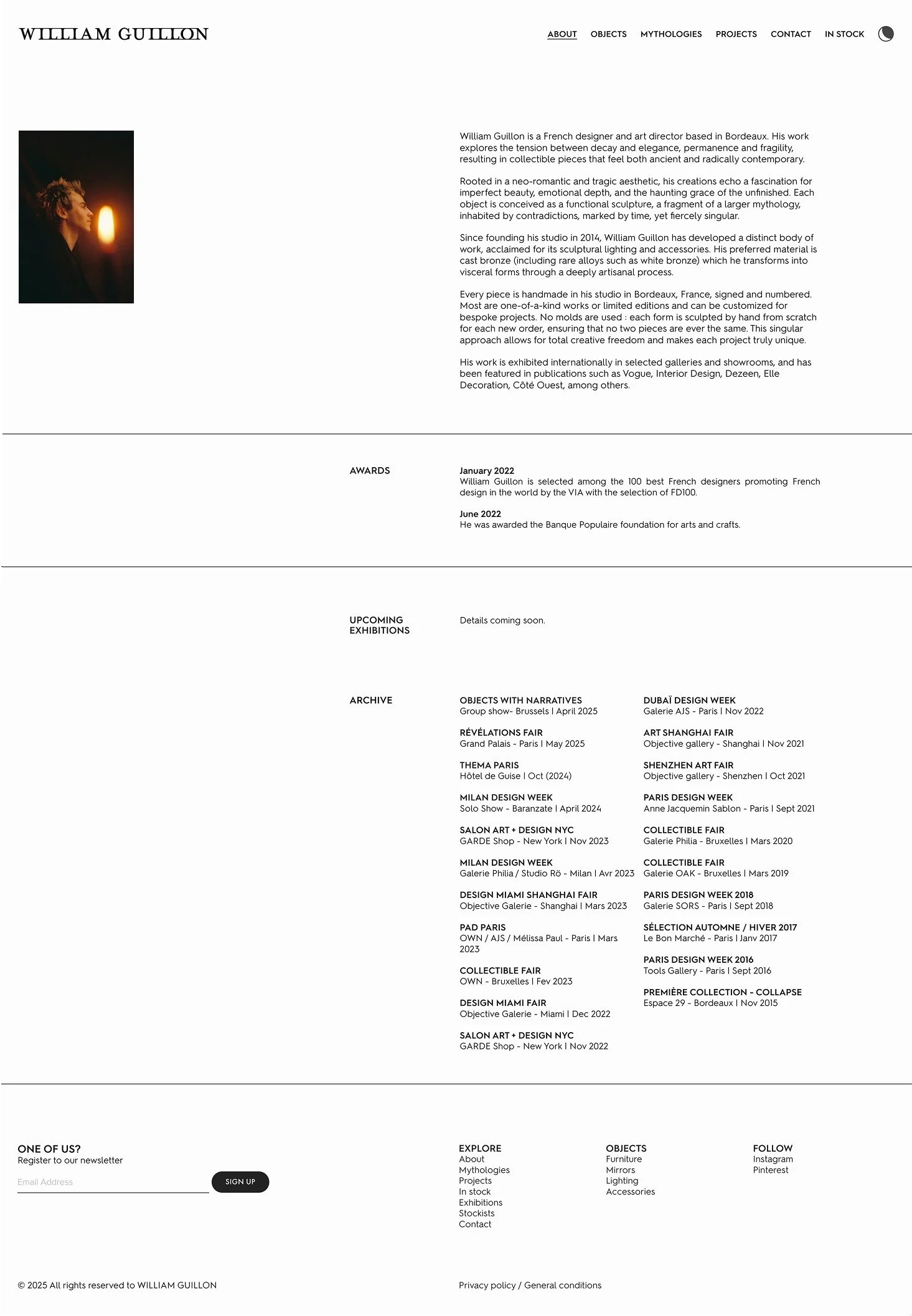
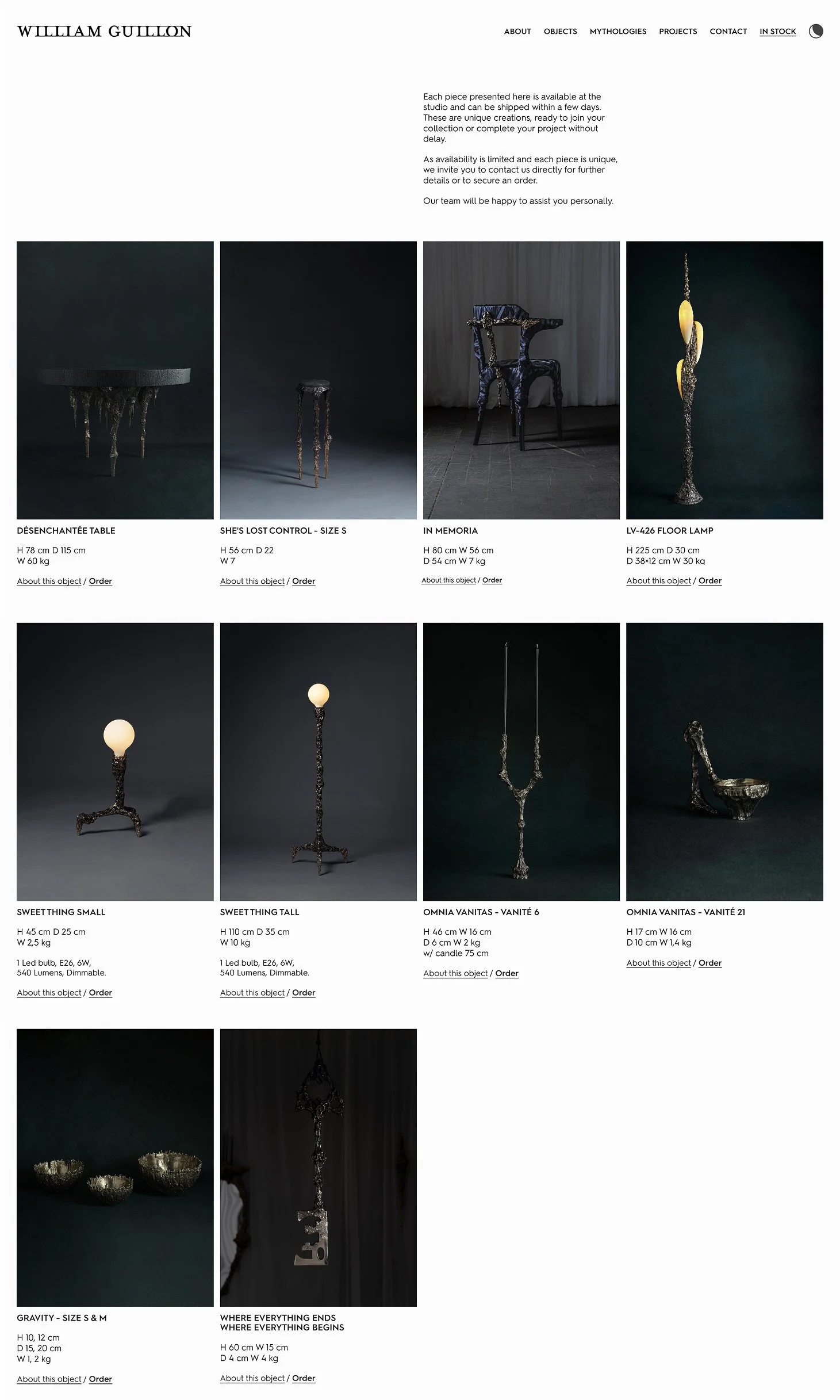
William Guillon is a bronze sculptor based in Bordeaux who makes collectable functional art: sculptural lighting and furniture cast in bronze. His work has been represented by top galleries and shown at PAD Paris, Design Miami, Collectible Fair Brussels, and Milan Design Week.
He had relied on galleries for his connection with clients, and now he wanted a direct relationship with his clients online, a space where collectors and interior designers could connect to his ethos, explore his catalog, and start conversations.
Approach:
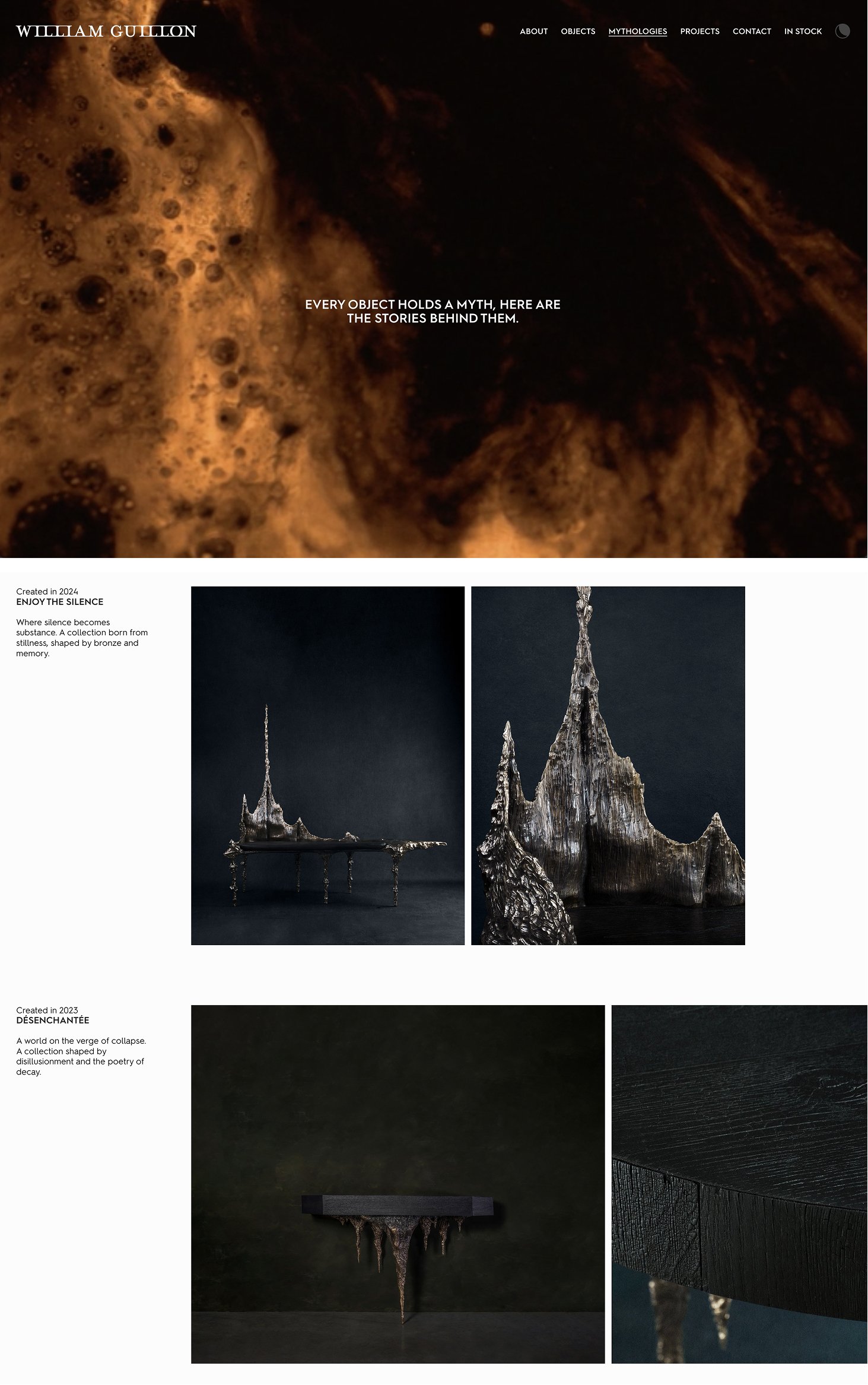
William describes his sensibility as "neo-romantic with a touch of rough." For us it meant creating a feeling of being alone with a piece of art, a sense of exploration, and a way to show the tangible roughness of William's work.
The homepage is an immersion into a moody edit from his Bordeaux workshop made by Maison Mouton Noir. The site's complete taxonomy is laid directly over this footage, so that a visitor is already inside the atmosphere while reading the map of the site.
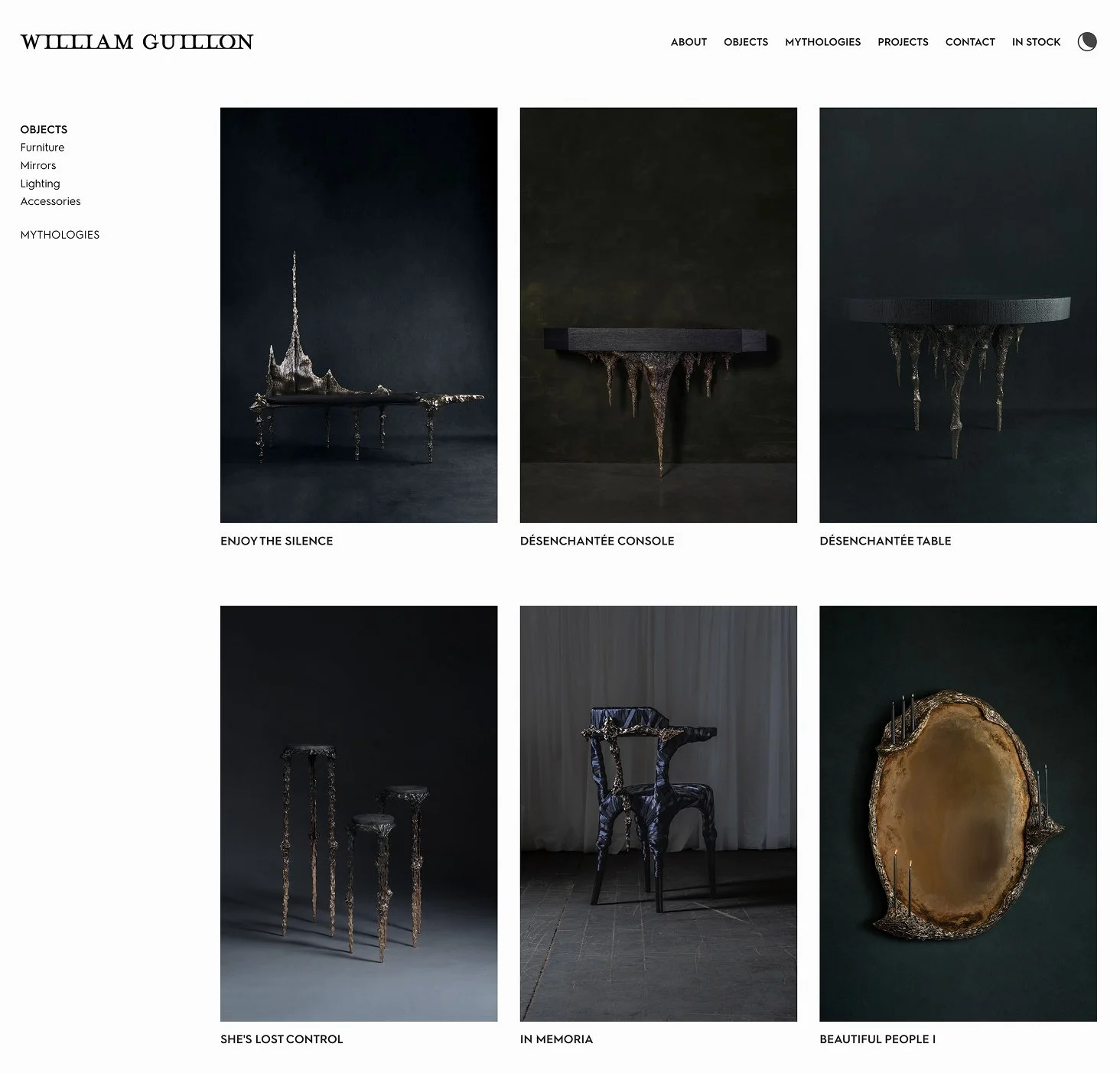
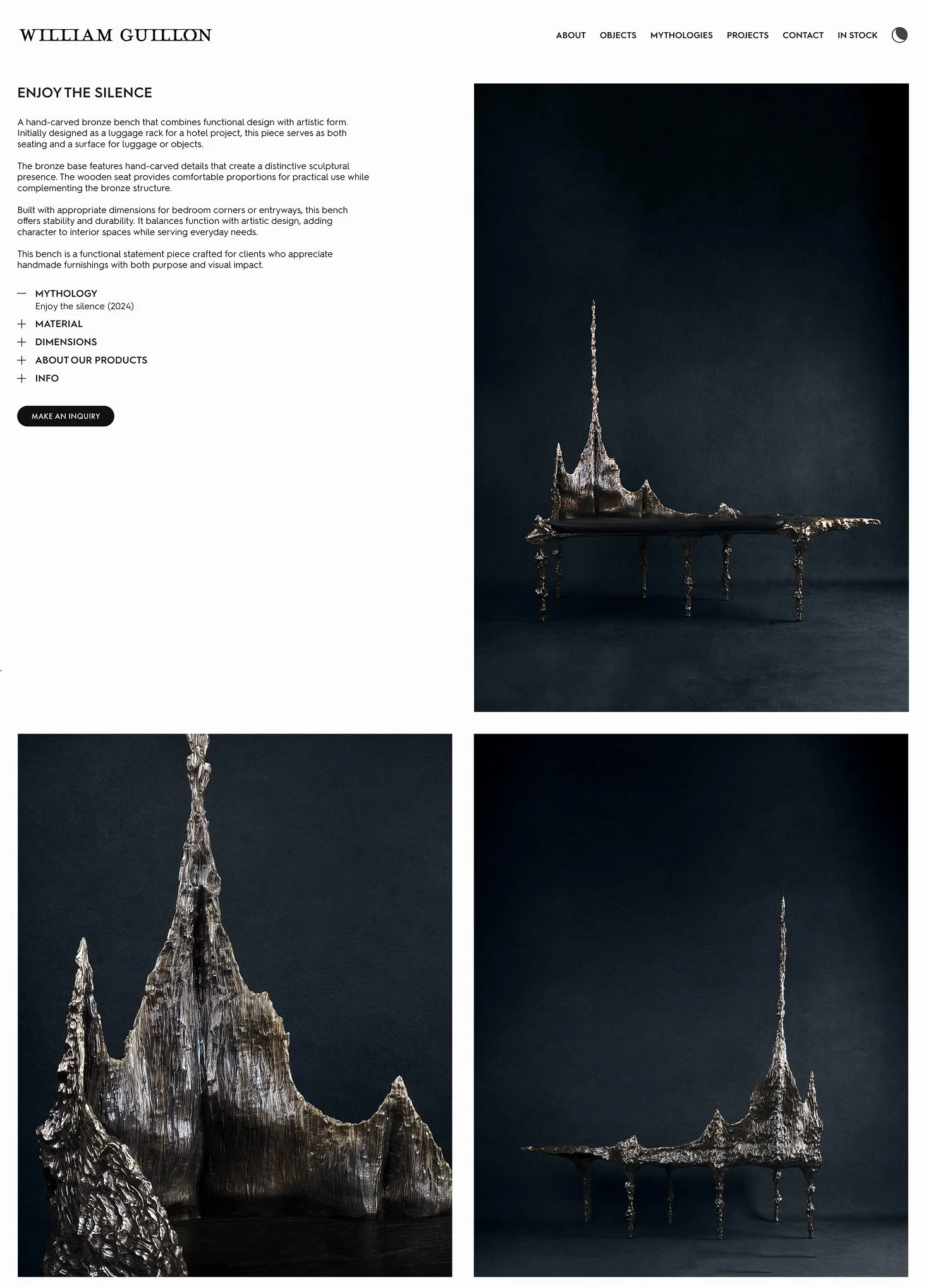
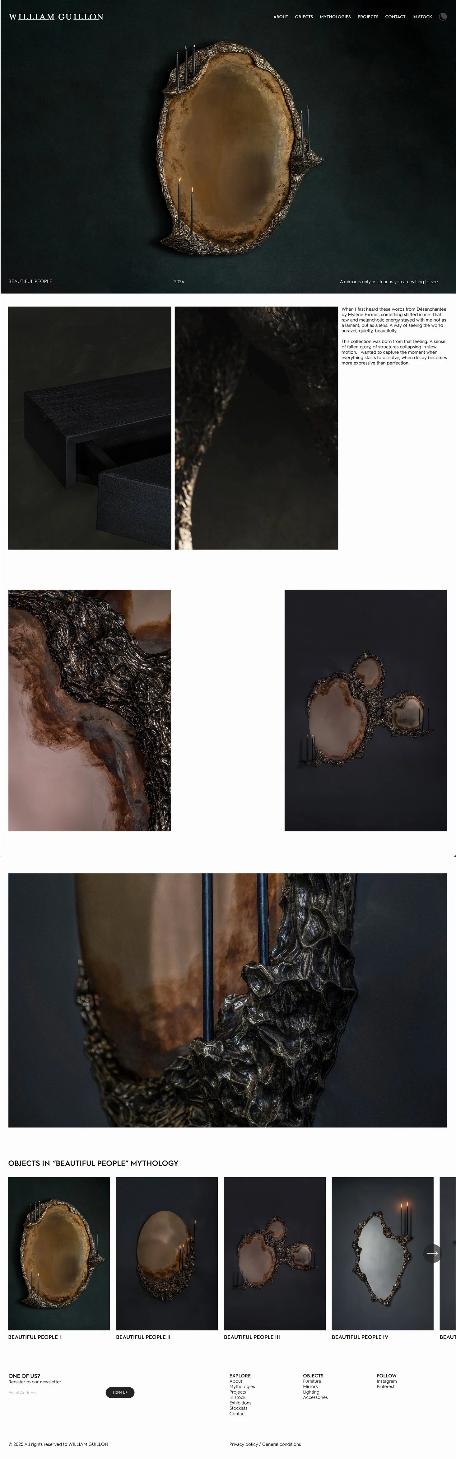
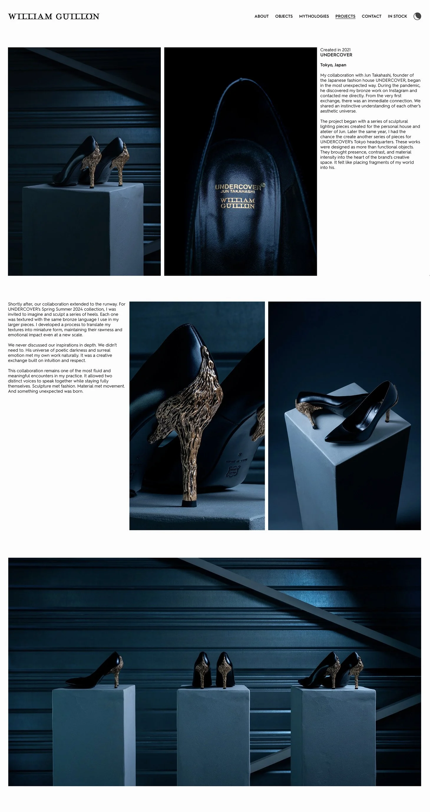
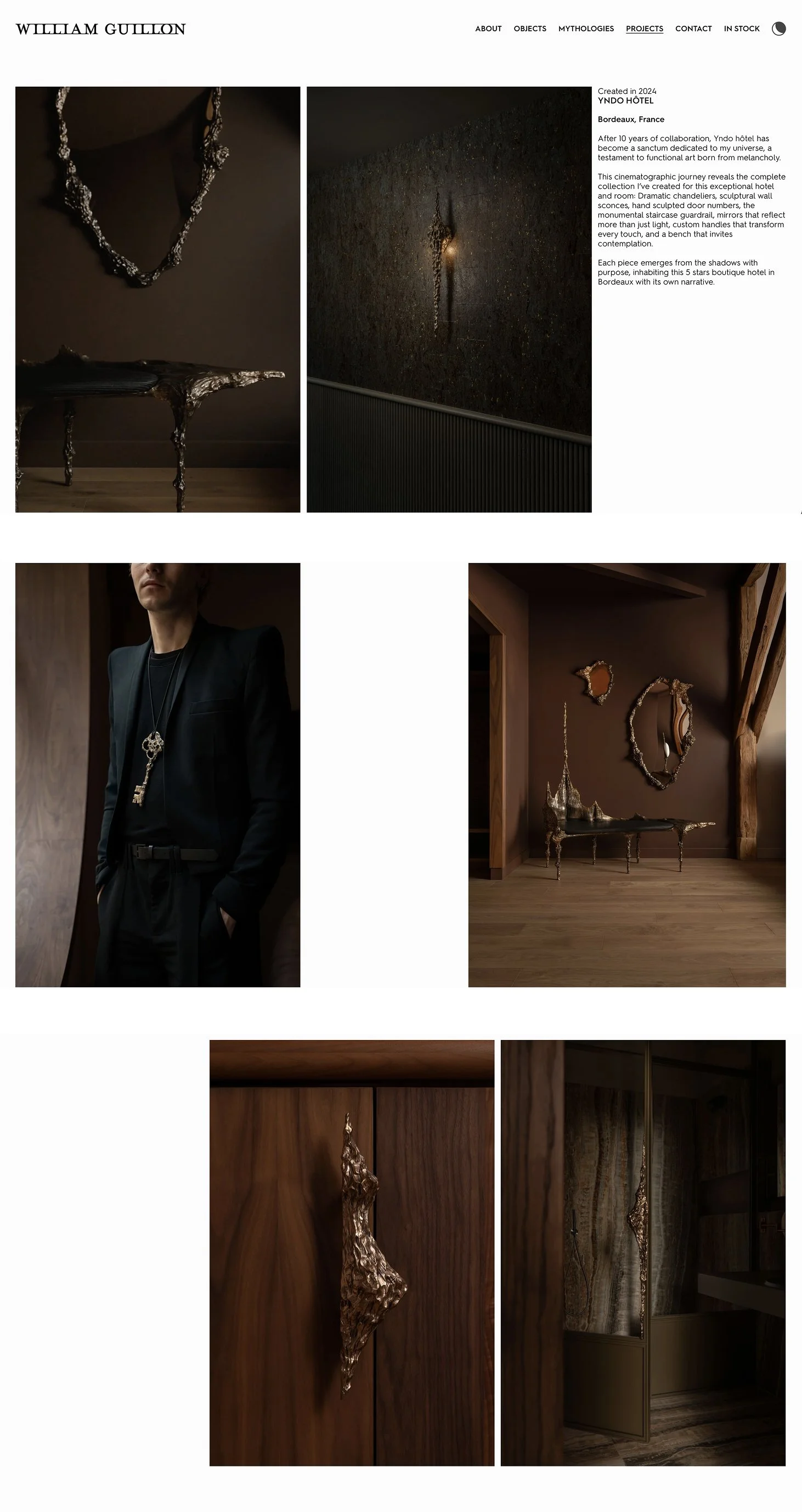
William had been creating vertical films of objects catching light, surfaces shifting as the camera moves. We placed these directly into the gallery grids, formatted to match the still images, two items per row, one static, one alive — a static grid where one frame suddenly breathes.
Restructure into two tracks:
Two parallel tracks of exploration: "Mythologies" for exploring collections, and "Objects" to serve as a catalog, built for clarity and filtering. One track for storytelling, one track for finding, and deep interlinking between them. We highlight his collaborations and bespoke work, which are almost as important as the Mythologies. Every aspect of William's work is visible on the homepage, immersed in the metalwork footage.
Typography:
Hurme Geometric Sans, a Finnish typeface with the plain, considered quality of gallery signage. It reads cleanly at small sizes, which was critical for our concept: intentionally small text to contrast with large and immersive visuals. At small sizes on dark backgrounds, the letterforms read as annotation.
Squarespace build:
The cataloging track uses Squarespace's native e-commerce functionality, with tagging and filtering to make exploration easy. Visitors inquire rather than add to cart, so that every transaction begins as a conversation. Vertical videos automatically cropped to integrate seamlessly in the grids. A custom sound toggle on the homepage lets visitors choose to hear the unique score.
Results:
The site signals to William's people that this is their place. It lets them explore the "Mythologies" without the mediation of a gallery, and serves as a functional catalog for when they are ready to engage on specifics. And William does not need anyone to manage and grow it.
“Redesigning my website was a crucial step for the studio. Over the years, the work had evolved significantly, and it became essential to create a platform that could truly reflect the depth of the project, both in terms of storytelling and the way the pieces are presented. Finding the right person to translate such a specific and niche universe into a clear, structured and compelling experience was not an easy task.
Working with The Blue-Eyed Barbarian made this process not only possible, but genuinely meaningful. He showed a rare combination of creativity, precision and sensitivity. He was deeply involved at every stage, always present, and incredibly accurate in the way he approached both the narrative and the visual structure of the site.
What impressed me the most was his ability to quickly understand the essence of my work and translate it into something both refined and accessible, without ever diluting its identity. He managed to bring clarity and hierarchy to a complex universe, while elevating it with a strong and coherent artistic direction.
His contribution had a real impact on how the studio is now perceived, and I truly believe this new platform marks an important step in its development.”
– William Guillon