Dirtworks Architecture
Translating the depth of a physical monograph into a responsive digital experience for an world-renowned landscape architecture studio.
the blue-eyed barbarian:
Denys Putilin, Olena Kvitkovska
Sector:
Landscape Architecture Studio
Website:
dirtworks.us
What we did:
Creative Direction
Website Design & Development
Year:
2025
Fonts:
Avenir by Adrian Frutiger

Client and the challenge:
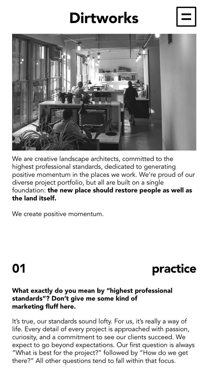
Dirtworks is an internationally recognized design studio dedicated to exploring the beneficial role nature can play in the built environment. As their team was evolving, they wanted a new digital presence to define their practice.
Dirtworks took a considered approach. Before addressing their digital presence needs, they undertook extensive internal work: defining their identity, establishing graphic precedents, selecting typography. By the time we joined, they were ready to share the findings of this strategic process. Our role was to translate this into a web presence.
Approach:
We mirrored their strategic approach by immersing ourselves in architectural publishing. From the dozens of monographs studied, two proved particularly instructive: "About Conditions" by Truwant+Rodet+, Mio Tsuneyama & Fuminori Nousaku, and "Trees, Time, Architecture! Design in Constant Transformation," the 2025 exhibition catalog from Architekturmuseum der TUM at Pinakothek der Moderne Munich.
From this research, a hypothesis emerged: to express Dirtworks' architectural identity by taking design cues from creative monographs. These publications, designed to represent the works, ideas, and identity of a practice, are highly visual, concept-driven, and organized around themes rather than chronology. The monograph became our design framework.
Design principles:
Working from this foundation, we established principles that translated architectural thinking into web design:
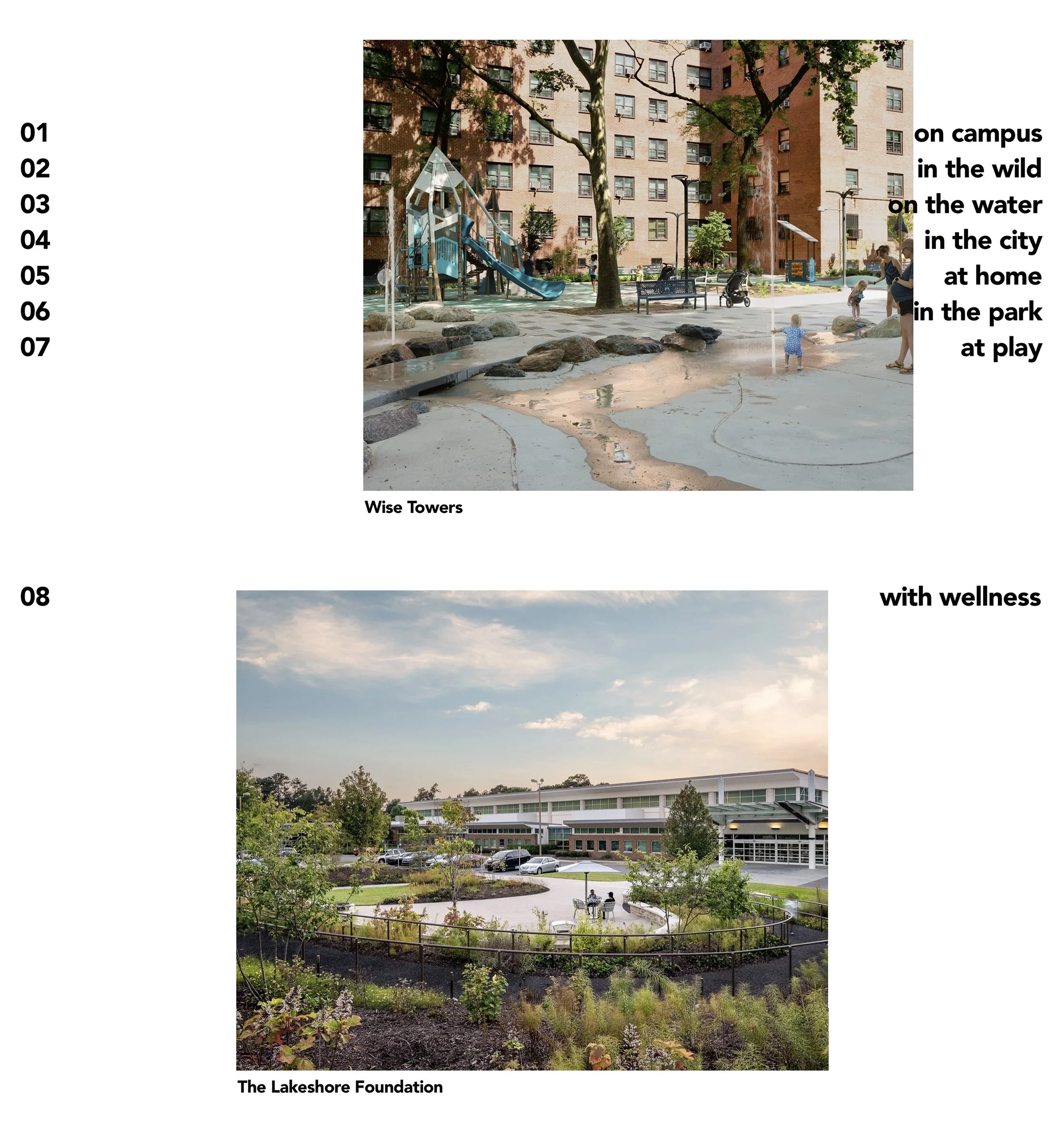
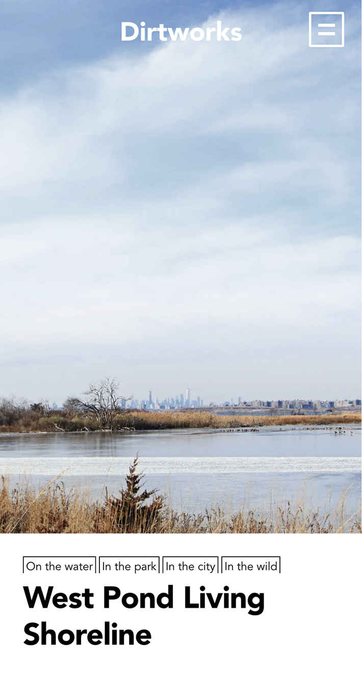
1. Layering. Landscape architectural drawings are built from distinct layers: topography, hardscape, planting, irrigation, lighting, each developed separately, then stacked to form the complete design. We translated this into the website by detaching foreground from background: logotype, menu, project images, and typology tags each occupy separate panes, activating as you scroll. The effect created what the client called “an explorative experience”.
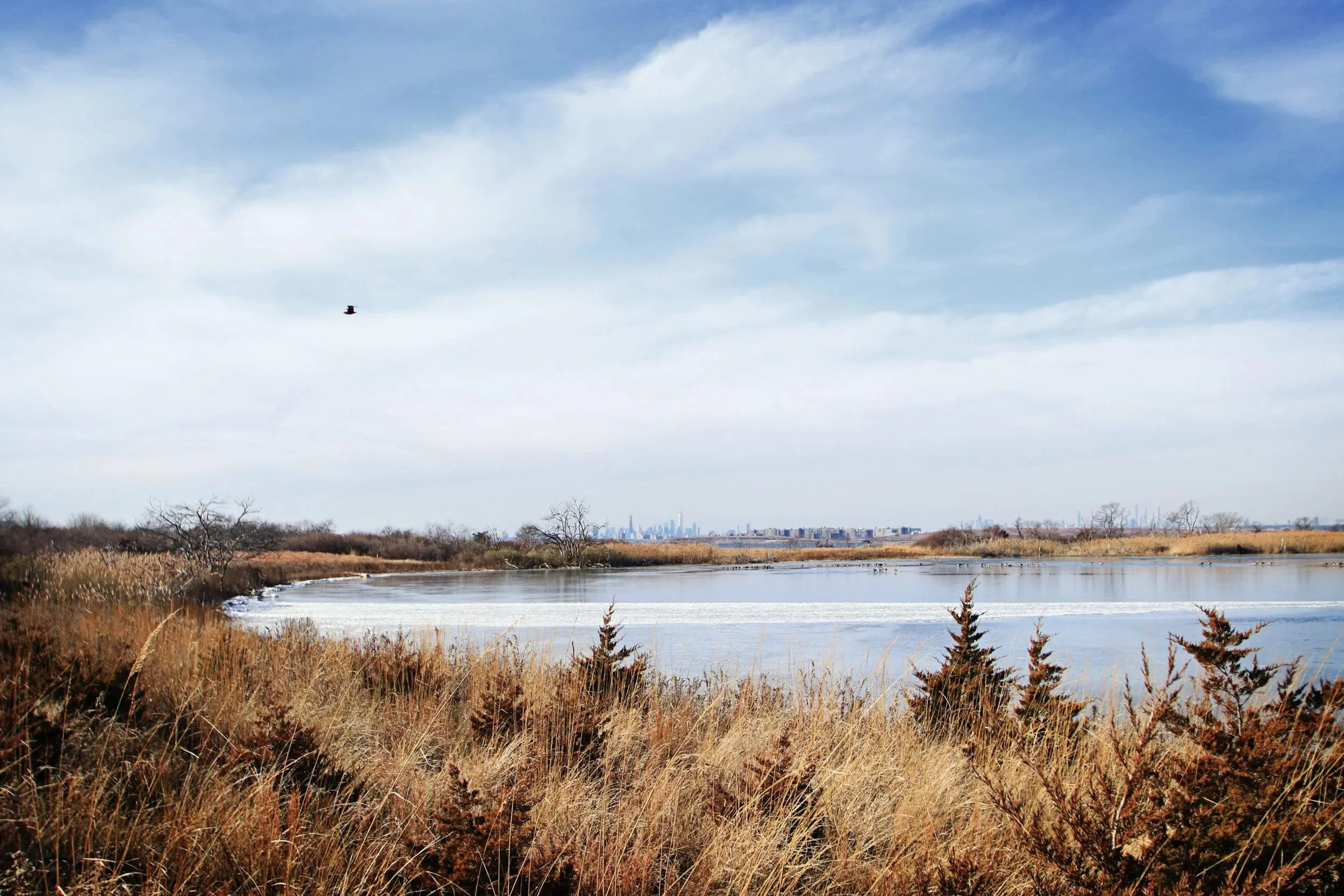
2. Visually-led storytelling. Project photography carries the narrative. Work is represented cleanly, telling its own story without over-contextualization or stylization. Text provides context without competing for attention.
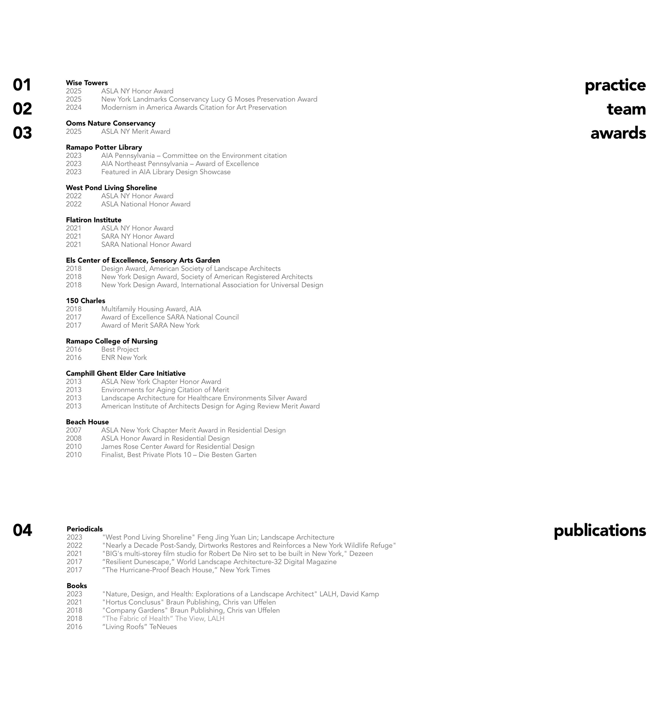
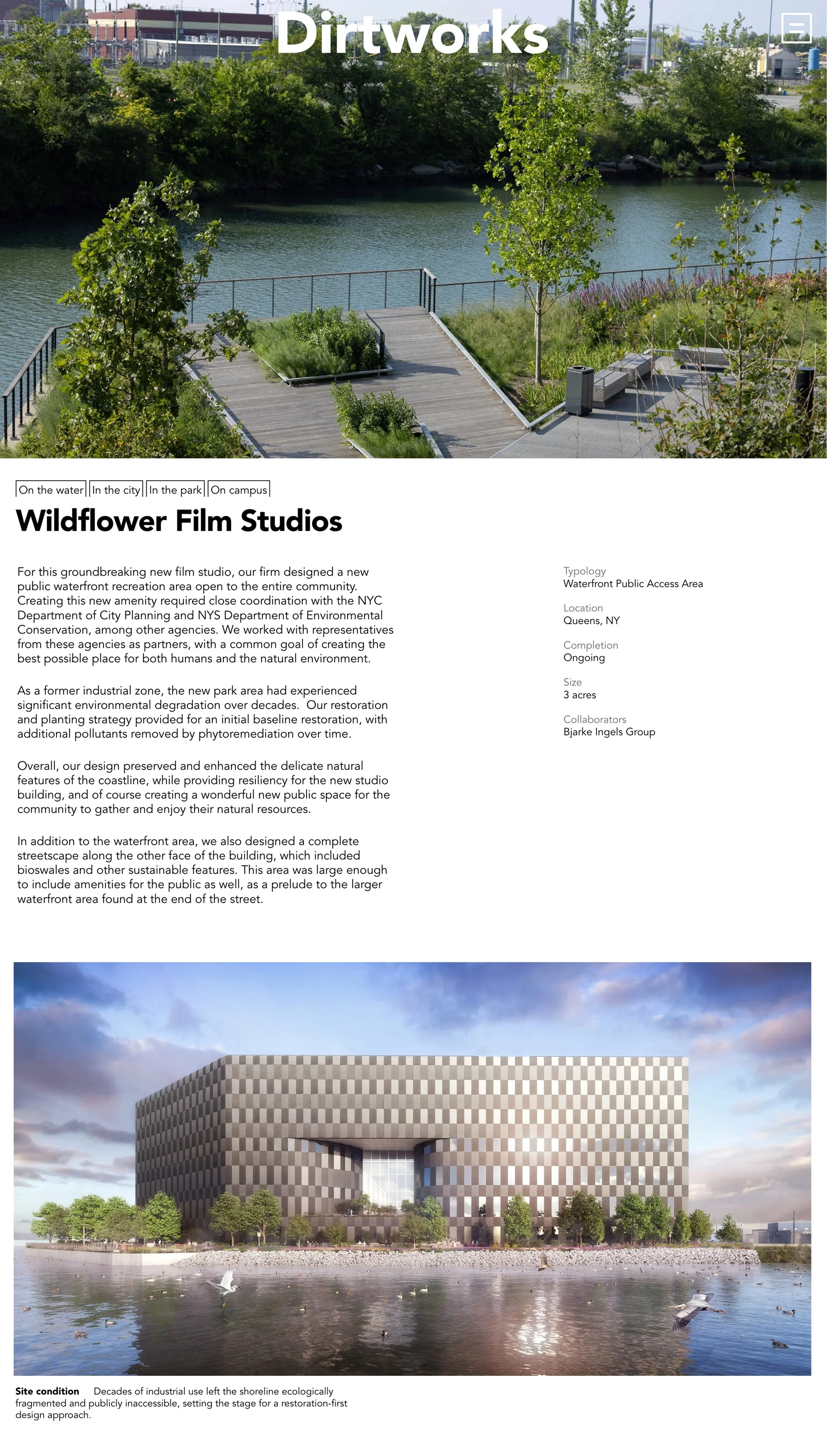
3. Deep research made visible. Meta information (typologies, features, dates) appears as design elements rather than hidden data: a nod to how monographs treat documentation as both functional and aesthetic.
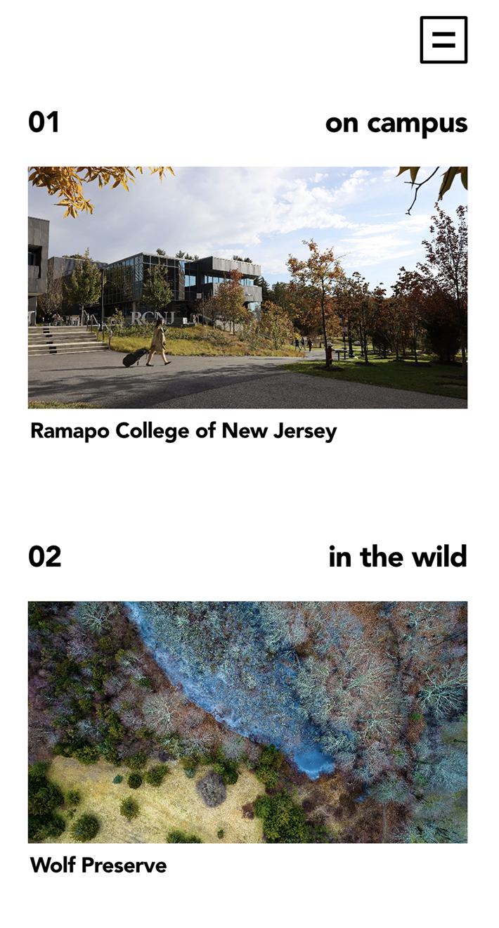
4. Spatial organization. Borrowing from architectural practice, where X and Y axes are fundamental tools, we developed a page template with project numbers anchored left, typology tags right, building in layers as visitors scroll. This structure maintains consistency across every page while allowing each project to breathe.
5. Consistency. The same design vernacular runs throughout the site. Every page speaks the same visual language. This insistent repetition creates a feeling of a methodical approach, core to what Dirtworks practices.
Typography:
The type system is deliberately restrained. One typeface throughout: Avenir Black for headlines, Avenir Book for body text. Minimal variation in scale, no stylistic flourishes.
This constraint serves the concept. Limited typographic variability reinforces the site's utilitarian character — consistent, methodical, low in stylization
Squarespace build:
We prioritized a build that ensures long-term client independence, utilizing Squarespace’s native layering features to create a dynamic, "explorative experience" without the need for high-maintenance custom code. This means Dirtworks can evolve their homepage without developer support.
Custom development was limited to two areas: project filtering across typologies and features (essential functionality for the body of work), and adaptive navigation behavior. The logo and menu come to attention and recede predictably as visitors scroll, responding to their background, appearing white over dark imagery, black over light areas.
Results:
The finished site does something the previous one couldn't: it communicates how Dirtworks thinks, not just what they've built. The monograph approach positions their projects within a larger intellectual framework, signaling to potential clients and collaborators that this is a practice driven by ideas.
“Working with Denys and his team was a uniquely positive experience from start to finish. Beyond the obvious talent that's on display in the finished product, Denys has a rare ability to read between the lines and understand not just the brief, but the people, values and sensibility behind it.
Our studio values collaboration, which can sometimes make feedback messy and nonlinear. Denys handled this with patience, clarity and a consistently good attitude. He helped us translate a lot of voices into a coherent direction, guiding the process without ever flattening it.
We could not be happier with our new website. It feels unmistakably Dirtworks; it doesn't just show our work, it communicates how we think. I'd recommend Denys and his team without hesitation to any studio looking for a developer who is as strong a listener and collaborator as he is a conceptual thinker, designer and developer.”
– Alex Hart, Principal