Gallivant Films
A production company website designed to sell nothing.
the blue-eyed barbarian:
Denys Putilin, Olena Kvitkovska
Sector:
Video production
Website:
gallivantfilms.com
What we did:
Creative Direction
Brand Identity
Website Design & Development
Year:
2026
Fonts:
Monument Grotesk and Stefan by Dinamo
Client and the challenge:
Rhys Thomas is an Emmy-award-winning director and producer whose work spans hundreds of Saturday Night Live sketches, the cult series Documentary Now!, Hawkeye, a limited series within the Marvel Universe, and commercial work across continents.
Gallivant doesn't need a website for work. The industry knows them, has seen the work, it is part of the cultural landscape. What they wanted was a place to document the past work on their own terms, open source creativity, done with a dose of humility and a sense of humor.
Approach:
Rhys had compiled what he calls a "Bible": a library of his inspirations, idiosyncrasies, journal entries, and sketches. We took that volume in, made sense of it, and proposed a design concept. Rhys then took the ideas further.
Design principles:
No guidance, let them have fun.
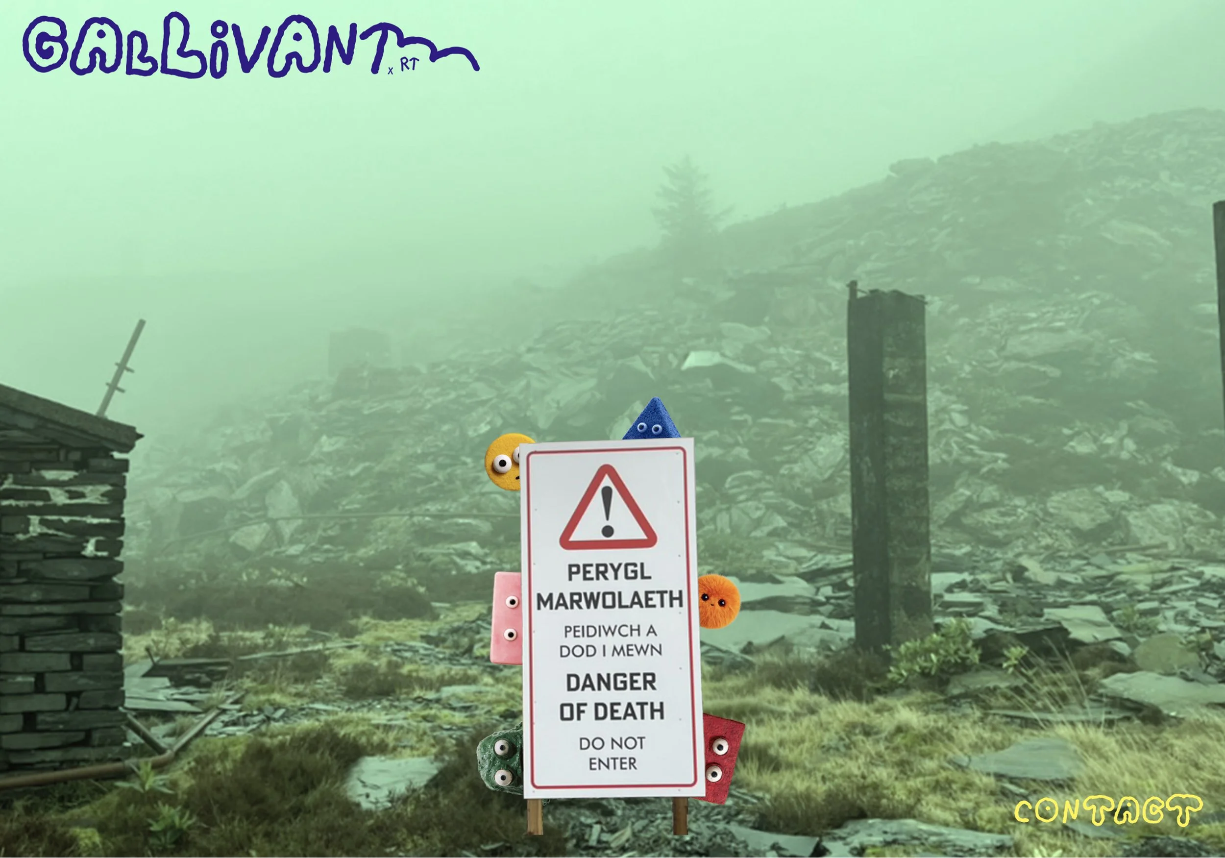
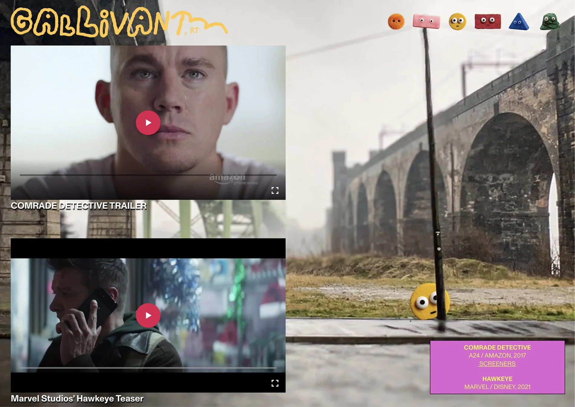
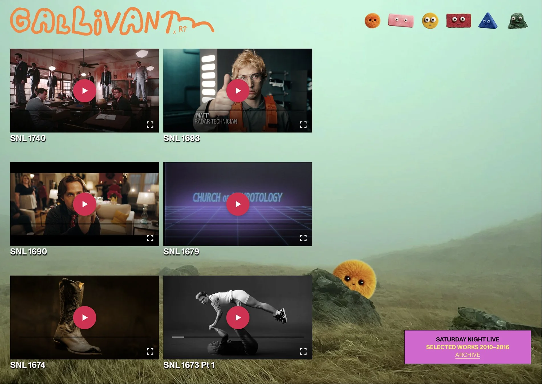
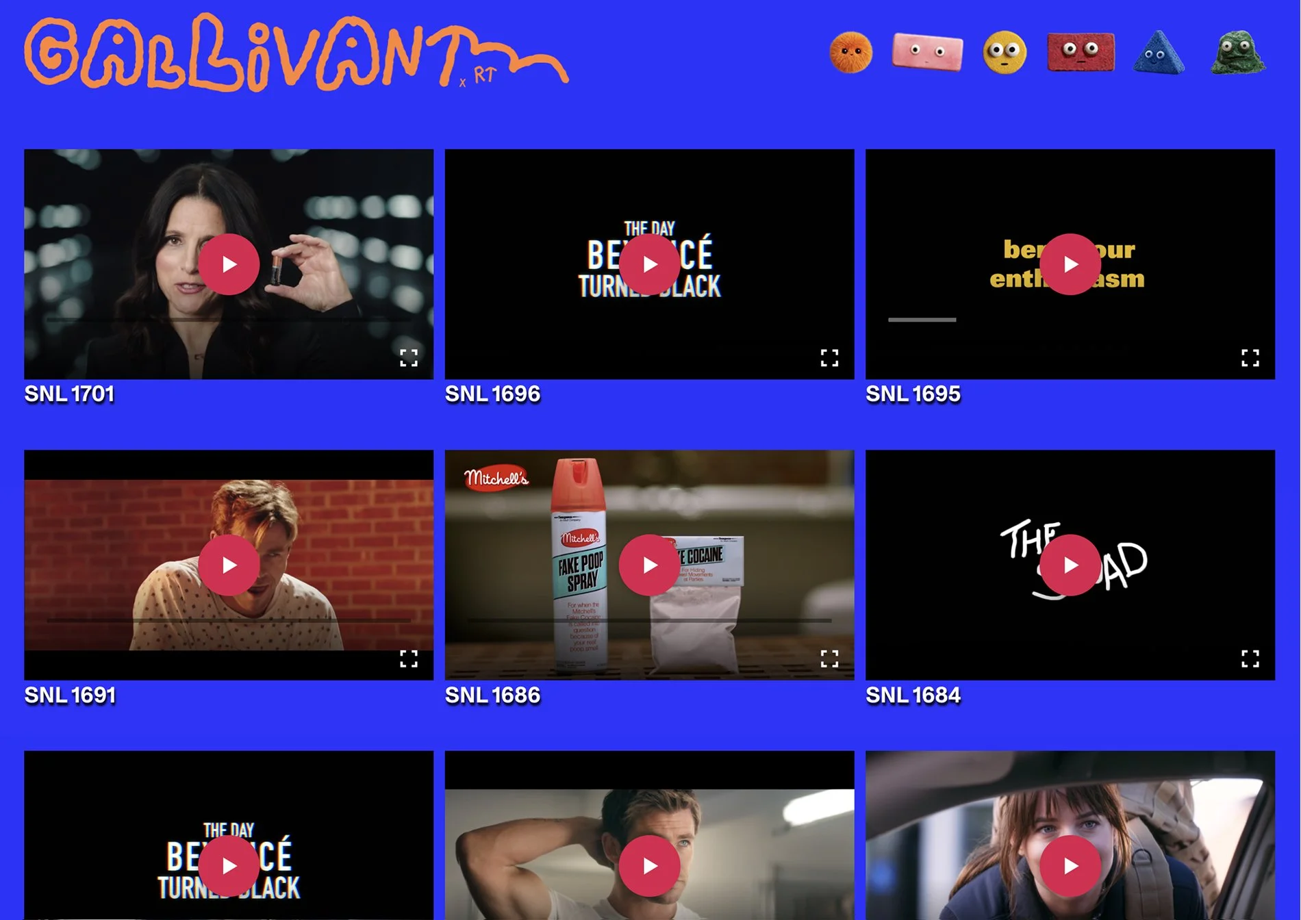
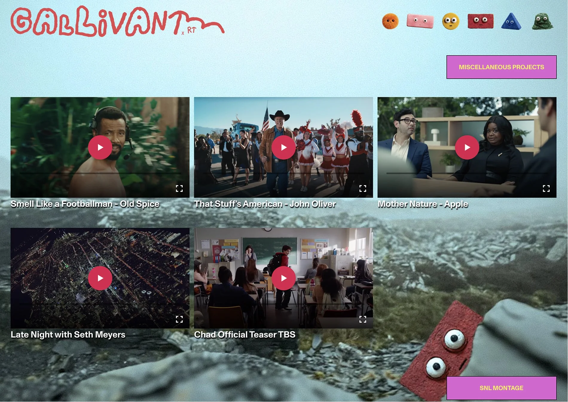
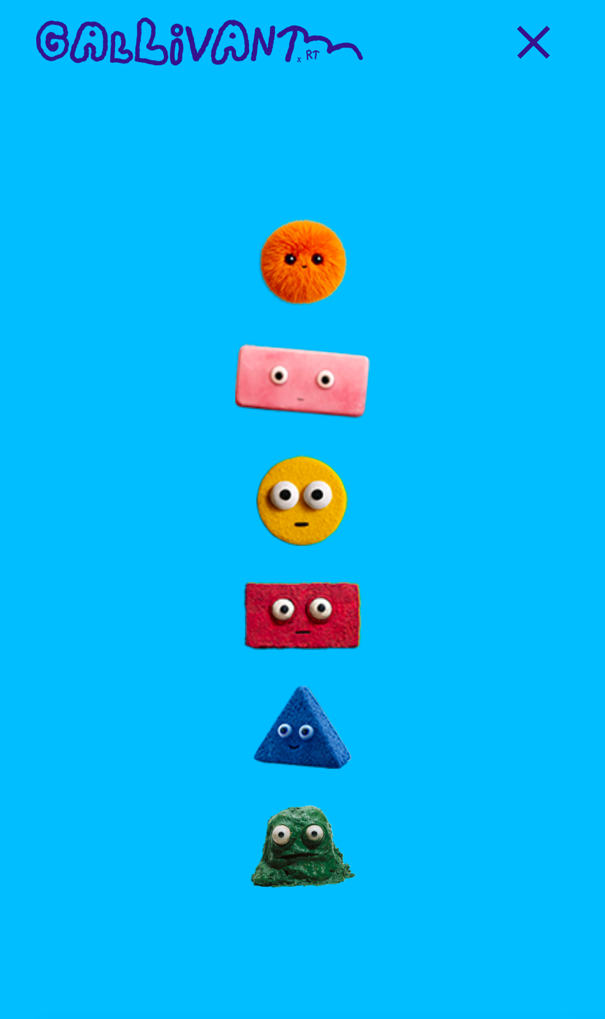
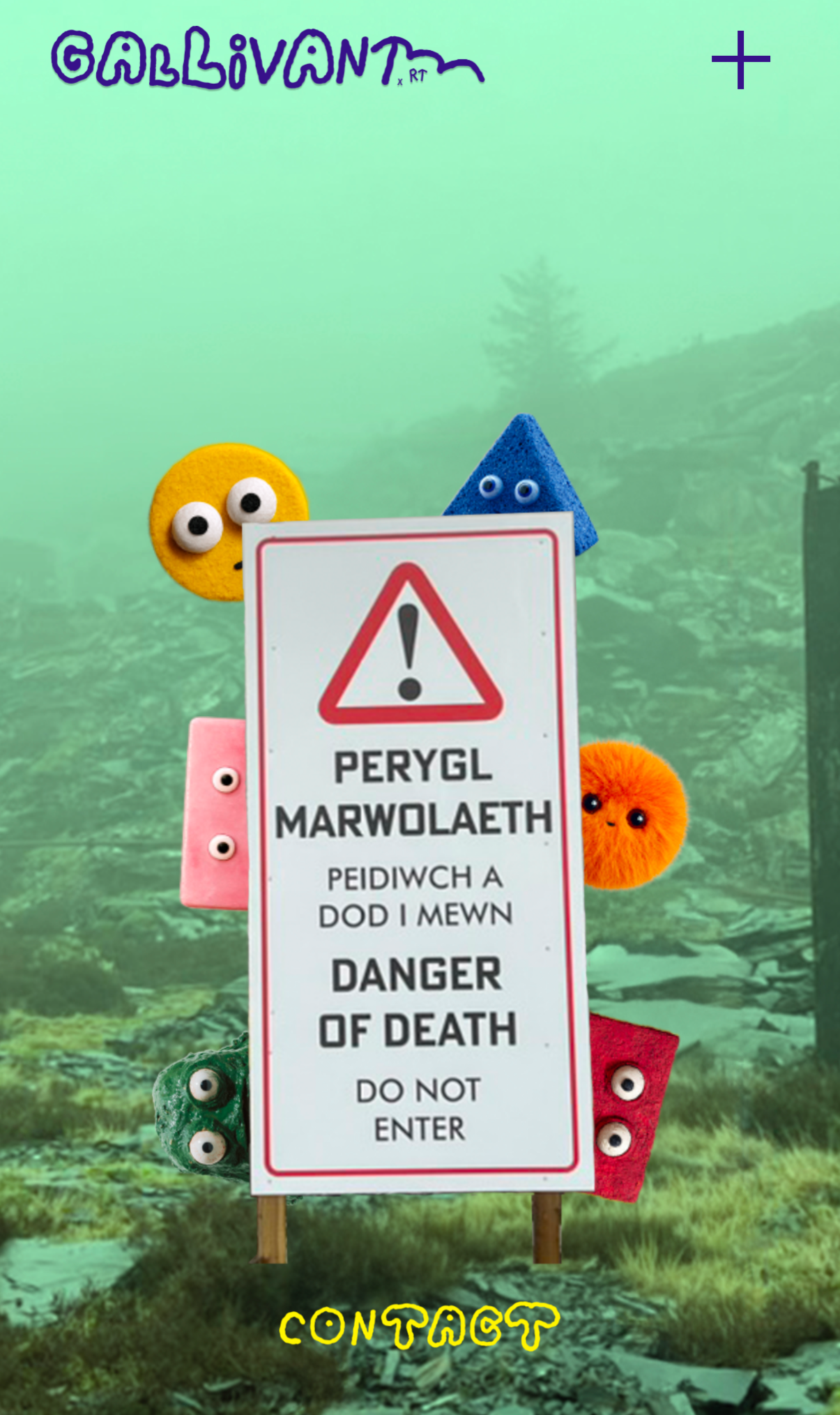
The range of the work is such that it should not be structured and put in categories. Rather than imposing a particular exploration path, we let visitors have fun with the website. We organized the filmography loosely across pages corresponding to periods and locations: New York, Los Angeles, Europe. But even that felt too prescriptive. Finally we decided to remove the page names entirely and replace them with characters. Rhys created and planted them throughout the website.
Early days of the internet.
The Gallivant ethos draws from the collage energy of Monty Python's animations, David Byrne's zine work, the daring visual culture of the 1970s and early 1980s. The medium now is a website, so we suggested tapping into the energy of the early internet: when there was no right or wrong, when websites could be genuinely strange. We translated this into fixed image backgrounds, pinned text boxes, a bit of scrapbooking, videos styled as desktop items with captions. Rhys then developed original background images for every page using his own photography. The homepage features his photograph of a street sign in his native Welsh.
Rough and imperfect handwriting.
We wanted to reflect the Gallivant style with a typeface that was playful but meticulously crafted. We found Stefan by Dinamo, a digitization of an artist's handwriting with all its inconsistencies, available in two versions: stick drawings and bubbles. Both applied with apparent randomness. Rhys embraced Stefan so fully that he proposed building the logo from it. We collaborated on the composition, mixing letter styles within the wordmark and adapting its color to match the character on each page. For the site texts and film captions, Monument Grotesk, also by Dinamo, styled as early computer system type.
Website design:
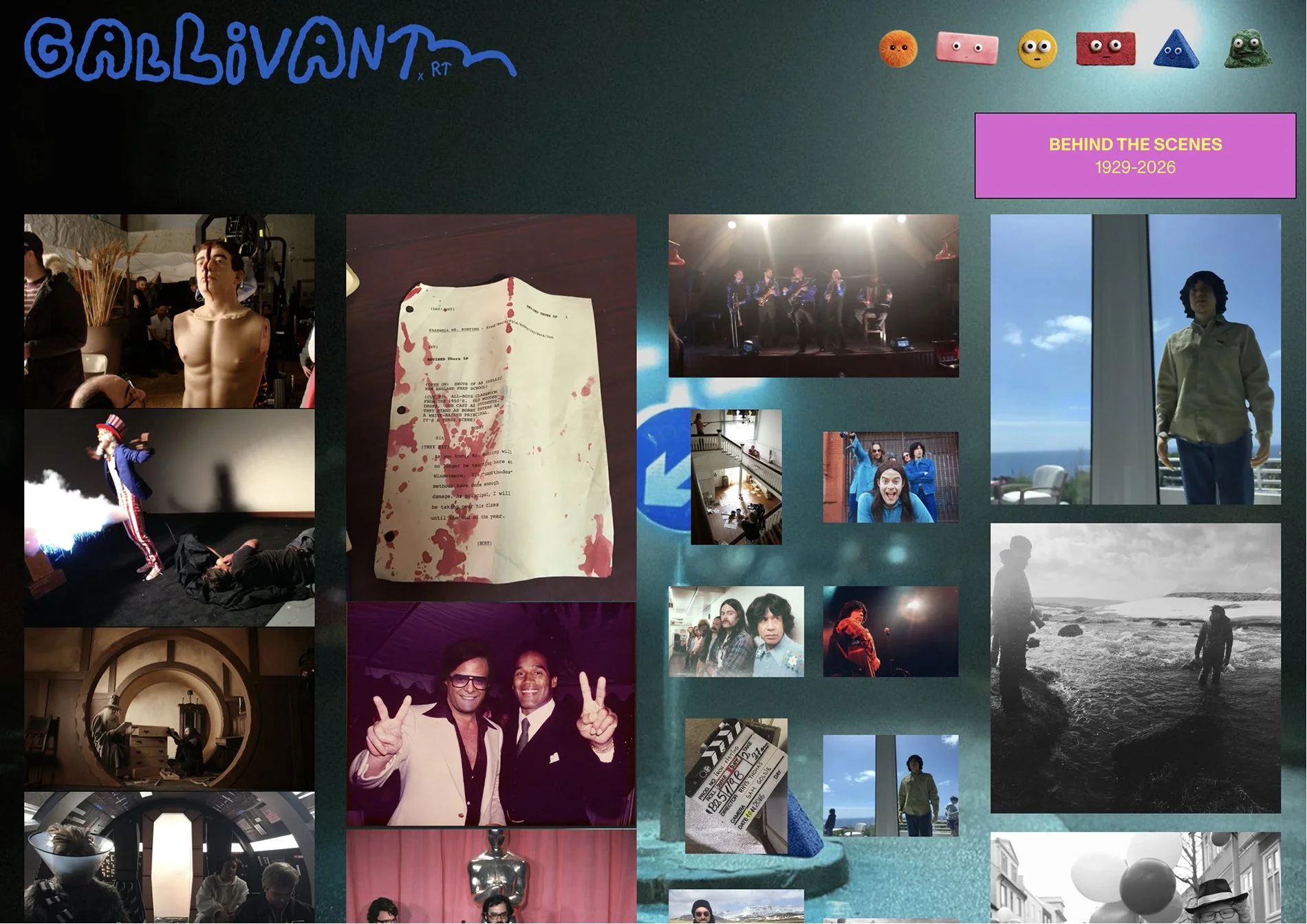
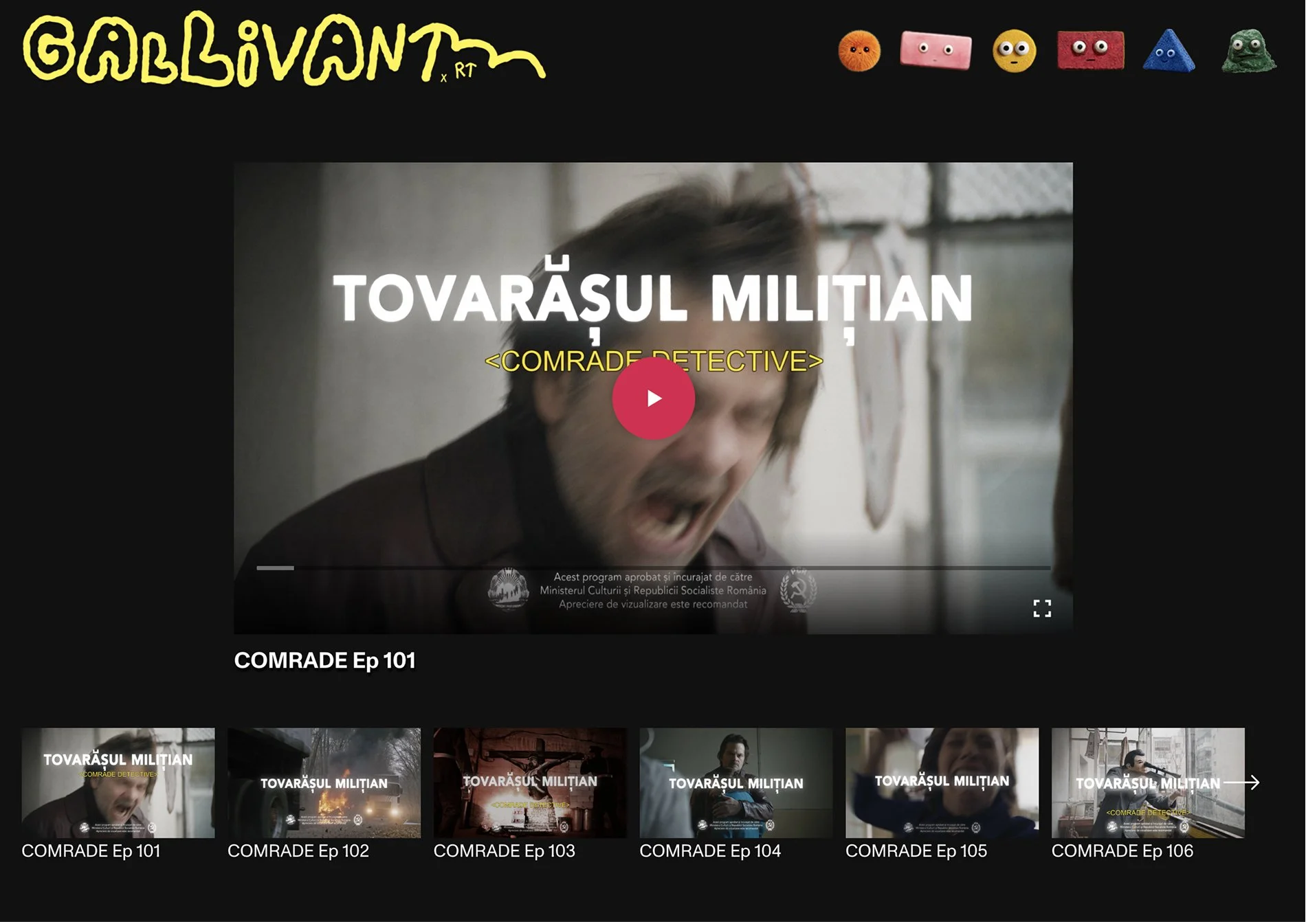
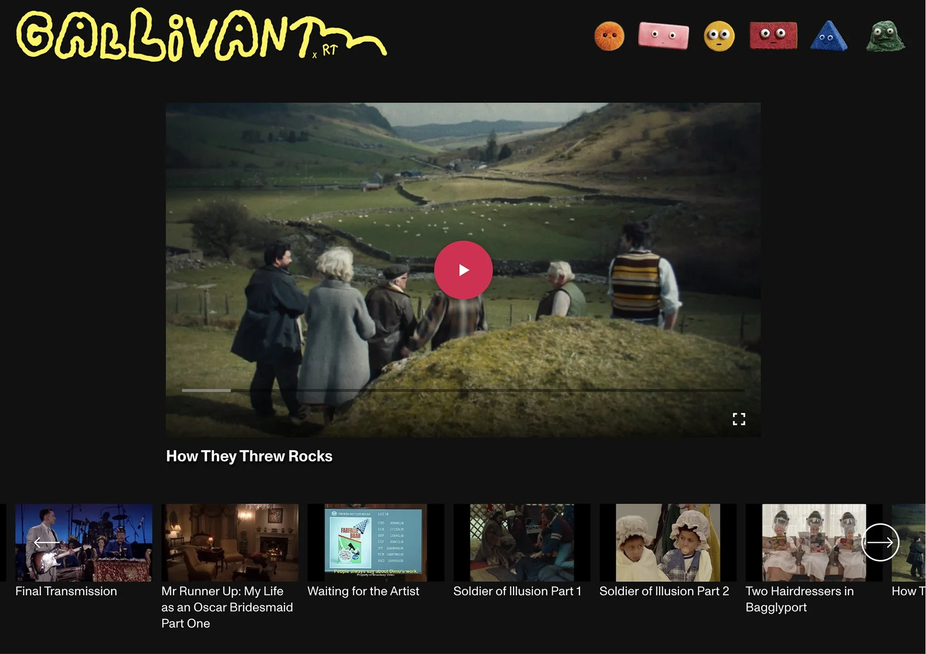
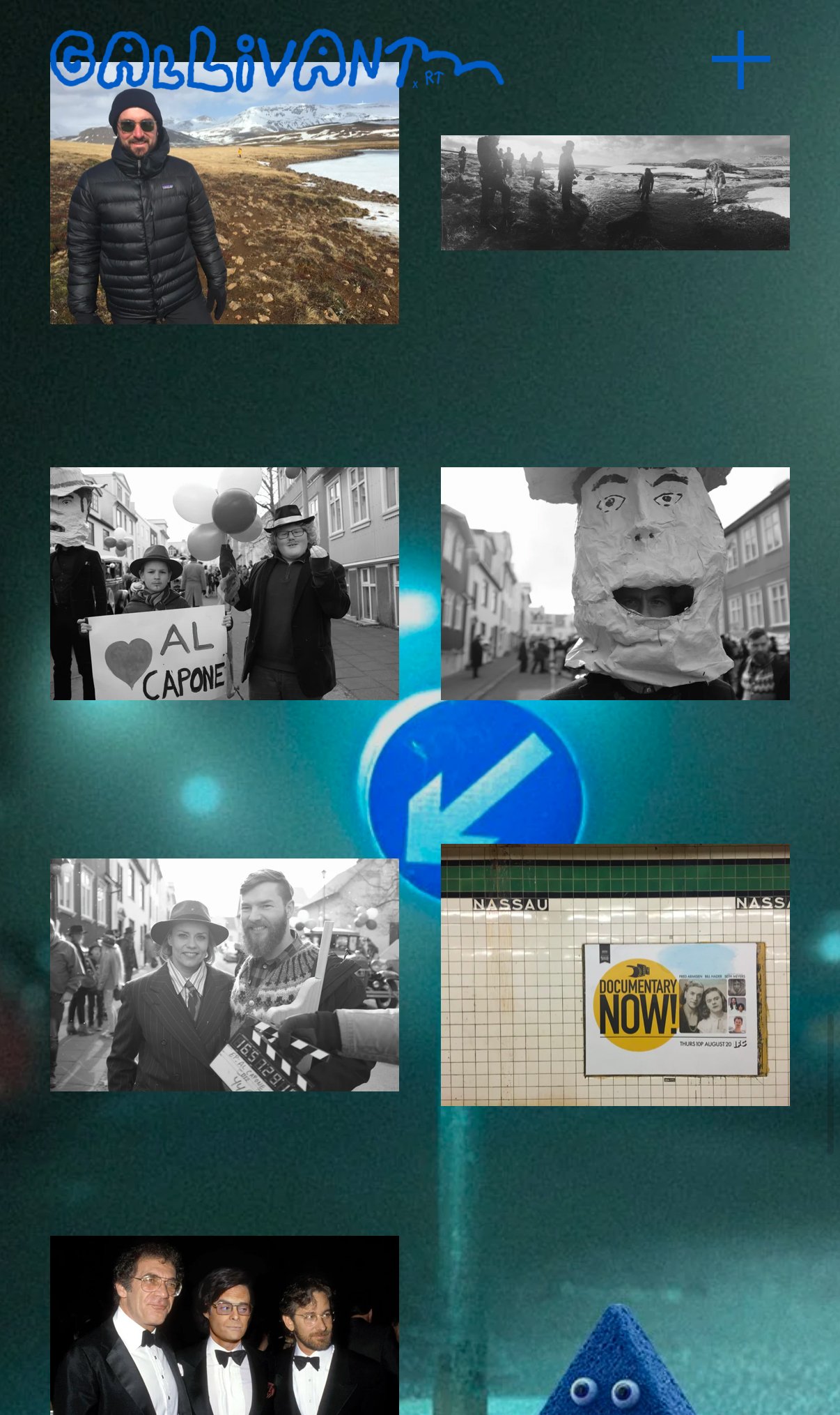
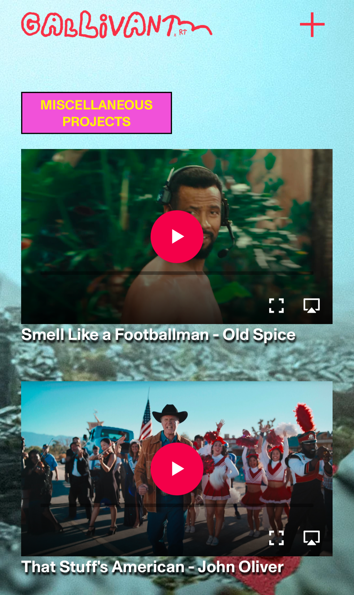
Structured as eras, with the homepage as the gateway into each. No text is used in the navigation: only curious characters, adding to a spirit of exploration. Every page has a pinned text box. The videos scroll in a custom layout on top of a fixed background image, each with a character peeking out. There are screener pages with full episodes and a backdoor with Rhys' journal, but you won't get in without a password. The Behind the Scenes content is structured on one page, different tiles creating a continuous wall of life.
Results:
The site is Gallivant. Everything visitors encounter came from Rhys's own creative practice, translated into something you can browse. And for all its refusal of convention, the site is clean. The structure is legible. The work is easy to find. You move through it with the same curiosity the name promises.
“Denys was a great collaborator in executing and designing our new website. He had to filter some unusual asks for this one as we didn’t have a traditional approach to what we wanted. He helped us focus our goals as a non-commercial site with the practicalities of design and usage. It was a great experience overall - Denys was patient and provided solutions and humor to the endeavor. Thank you!”
– Michelle Stockwell, Gallivant Films