DOMA
An anti-corporate communication consulting site that conveys the many facets of work at once.
What we did:
Creative Direction
Brand Identity
Website Design & Development
Year:
2026
Fonts:
BRRR by Swiss Typefaces
Helvetica Neue by Linotype
Client and the challenge
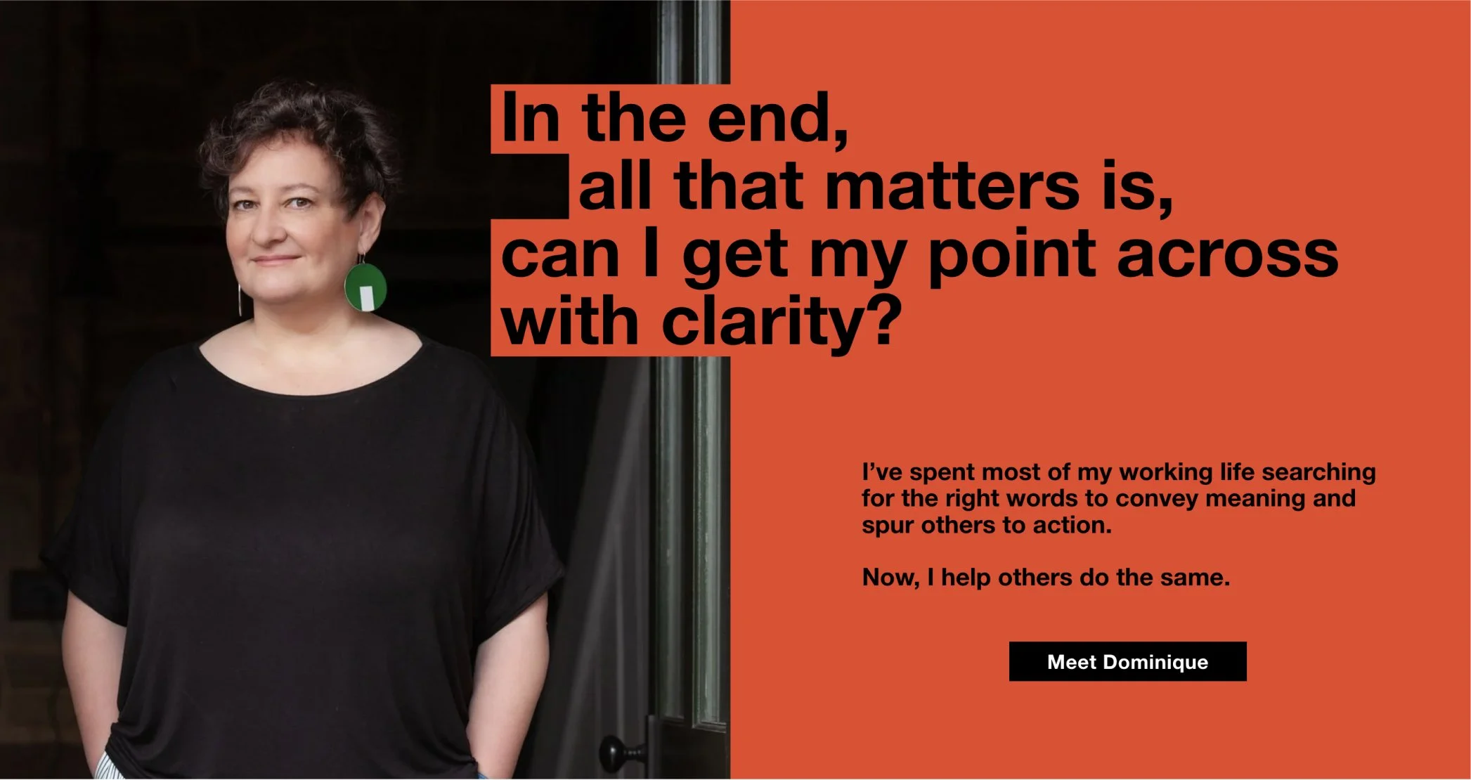
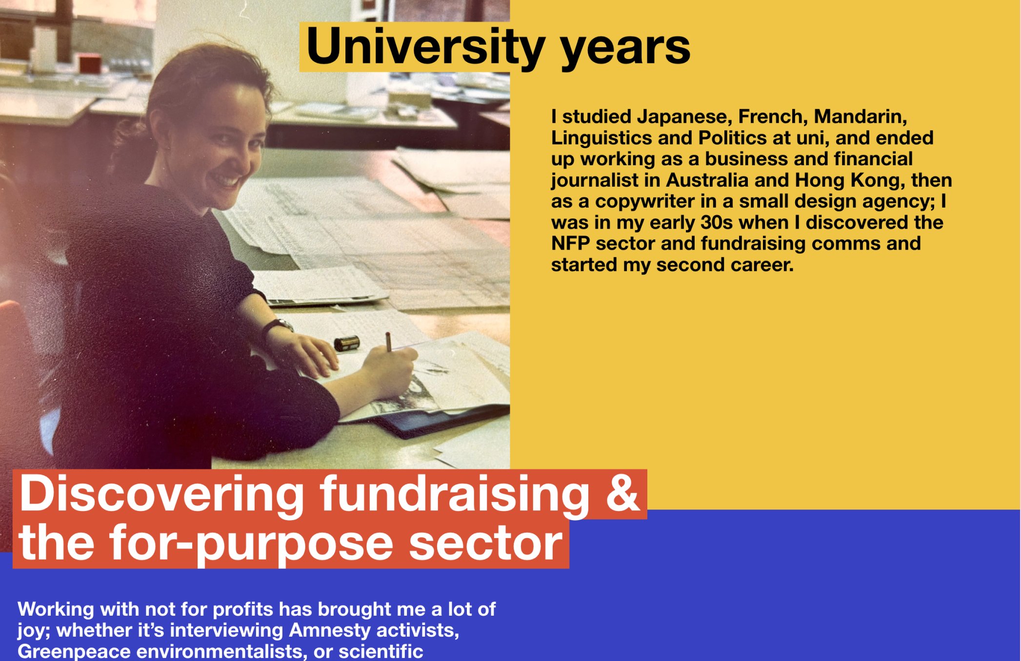
A life-long veteran in non-profit communications, preparing for the next major chapter of her career, Dominique is slowly handing the company she founded to her team, allowing her to now focus on training, speaking and one-on-one consulting. Everything from the name to the visual identity was up for discussion.
In interviews, we uncovered that Dominique didn't want to be contained in one definitive package. She is a multi-faceted creative personality with a wide range of interests, from writing children's books to organising large events to running fundraising workshops. These interests cannot be neatly packaged in one offering. They are scattered: and that is the point. Tapping into different worlds, she pulls insights and makes connections that allow her to find unconventional solutions.
Approach
How does a practice that ranges from children's books to charity rebrands to TEDx stages hold together visually? You can't unify it through subject matter. You can't unify it through tone. You need a compositional system that treats difference as the raw material.
An idea came from a movie storyboard. Different shots done in a simple grid. The structure was there, yet every scene was distinct. The viewer can compose a full picture in their mind. This was the foundation: we will create precedents of Dominique's practice as scenes in a grid.
Then, looking for a grid system, we noticed Dominique wears a watch in Bauhaus style. We started there. Mondrian proposed his solution a century ago. Rectangles of different sizes, colours, proportions, held in tension by a grid that never bends. Nothing matches. Nothing is out of place. We borrowed this logic: a structural framework where scattered content becomes composition.
Design principles
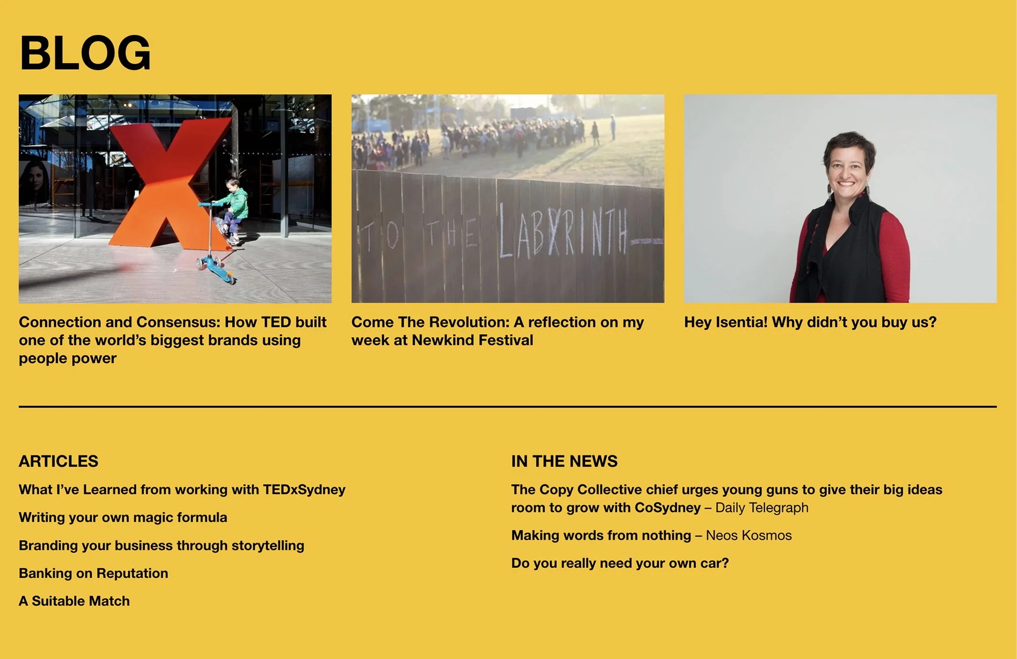
1. Intentionally scattered. We showcase the precedents of Dominique's practice as vignettes on the first screen. Scattered, but also ordered, working as a whole, forming a full landscape of her range. The TEDx work occupies the same visual field as a children's book and a charity rebrand. Each vignette shows a collaboration and its proof, not just Dominique's output.
2. Cinematic sequence. We treat each vignette like frames from a movie: first, the opening titles introducing DOMA, then different stories of client collaborations, then a shot from her podcast show, followed by a book that she published, leading to shots from a workshop session. Visitors read the homepage the way they'd watch a title sequence. Each frame a different register, building a cumulative portrait.
Brand identity
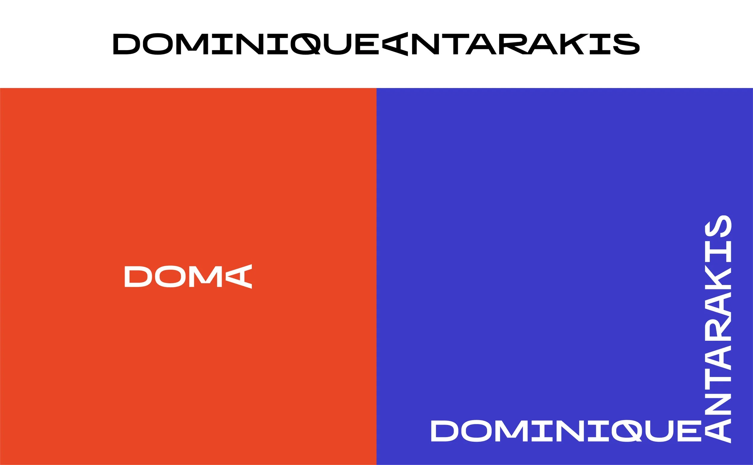
We scrutinised the suggested name DOMA Consulting and decided it's best to strip off "consulting". When you work with DOMA you work only with Dominique, and the journey you take with her is not the usual consulting engagement. The name itself is rooted in the personal: DOMinique Antarakis, which gave us a structural idea separating DOM from A. Toying with the A, we discovered it can be turned on its side, hinting at a megaphone. A light, quirky detail that stuck.
This led us to BRRR by Swiss Typefaces, a family designed in both horizontal and vertical scripts, each with modified letter shapes.
The logo works in three versions: the short DOMA mark, the full name running horizontal, and a corner lockup where DOMINIQUE runs along one axis while ANTARAKIS runs along the other.
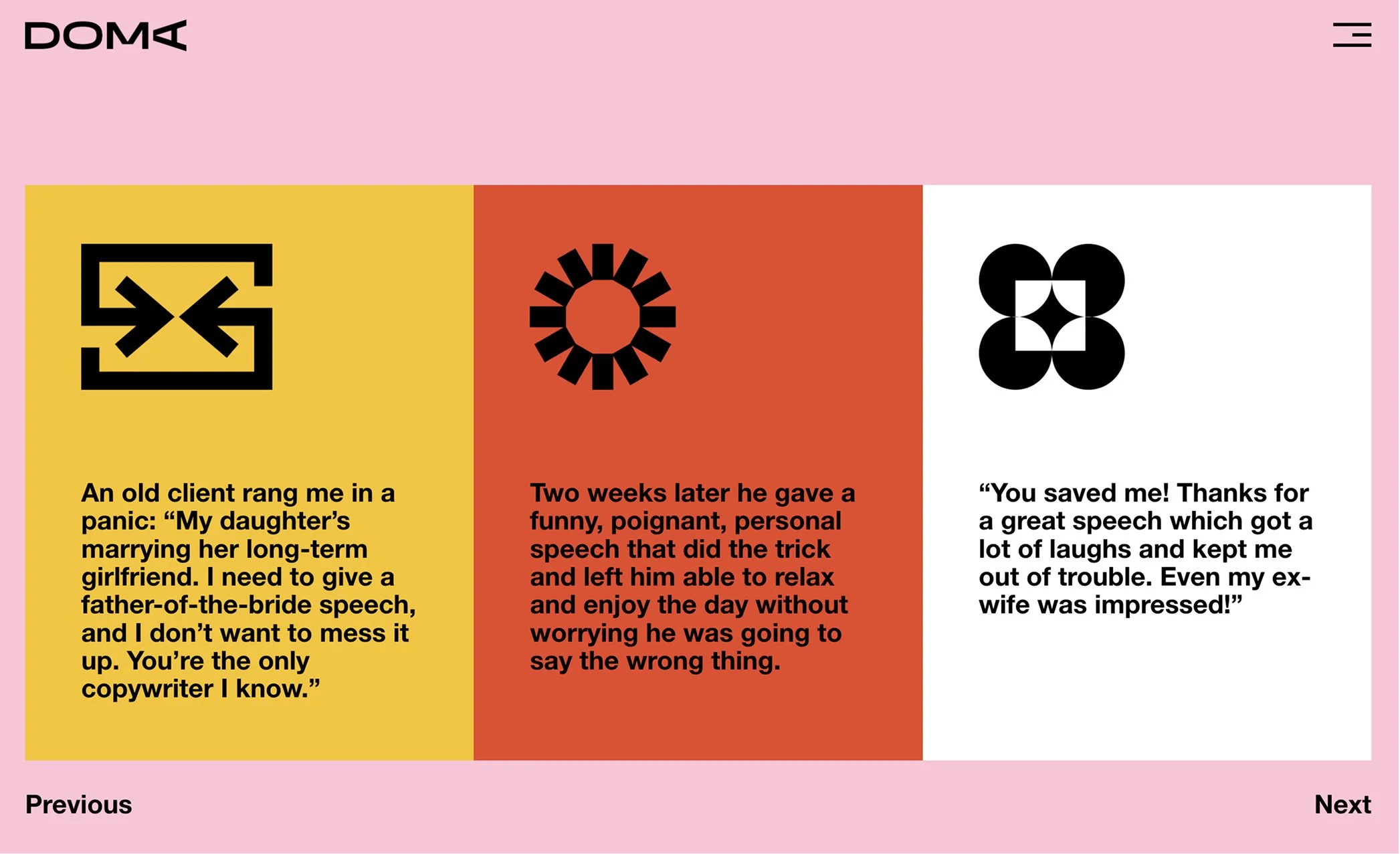
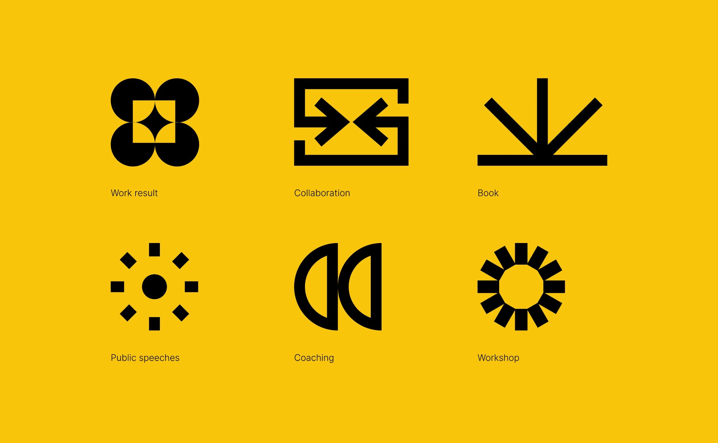
We developed a set of geometric symbols categorising the types of work Dominique does: collaboration, one-on-one coaching, public speeches, workshops, books. One visual system for different activities to allow us to skip some words.
Typography and color
BRRR is reserved for the logo and brand moments. For the website, Helvetica Neue. Legible, strong, and balancing the scattered nature of the layouts. The grid carries the energy; the type stays steady.
Colour-wise, a high-energy high-contrast palette with a note of earthiness, taking our cue from Dominique's love of bold colours. Red, blue, and yellow on near-black.
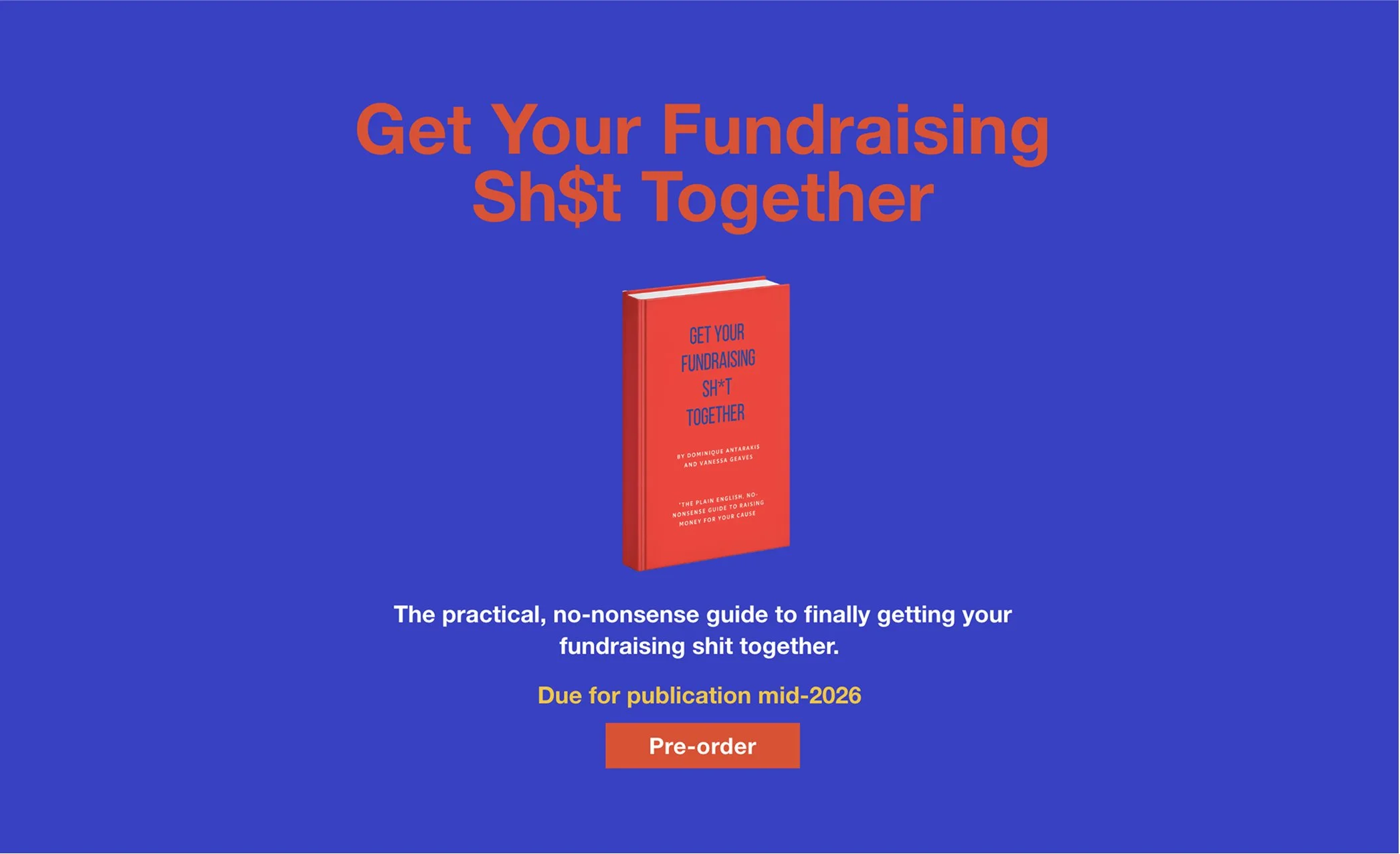
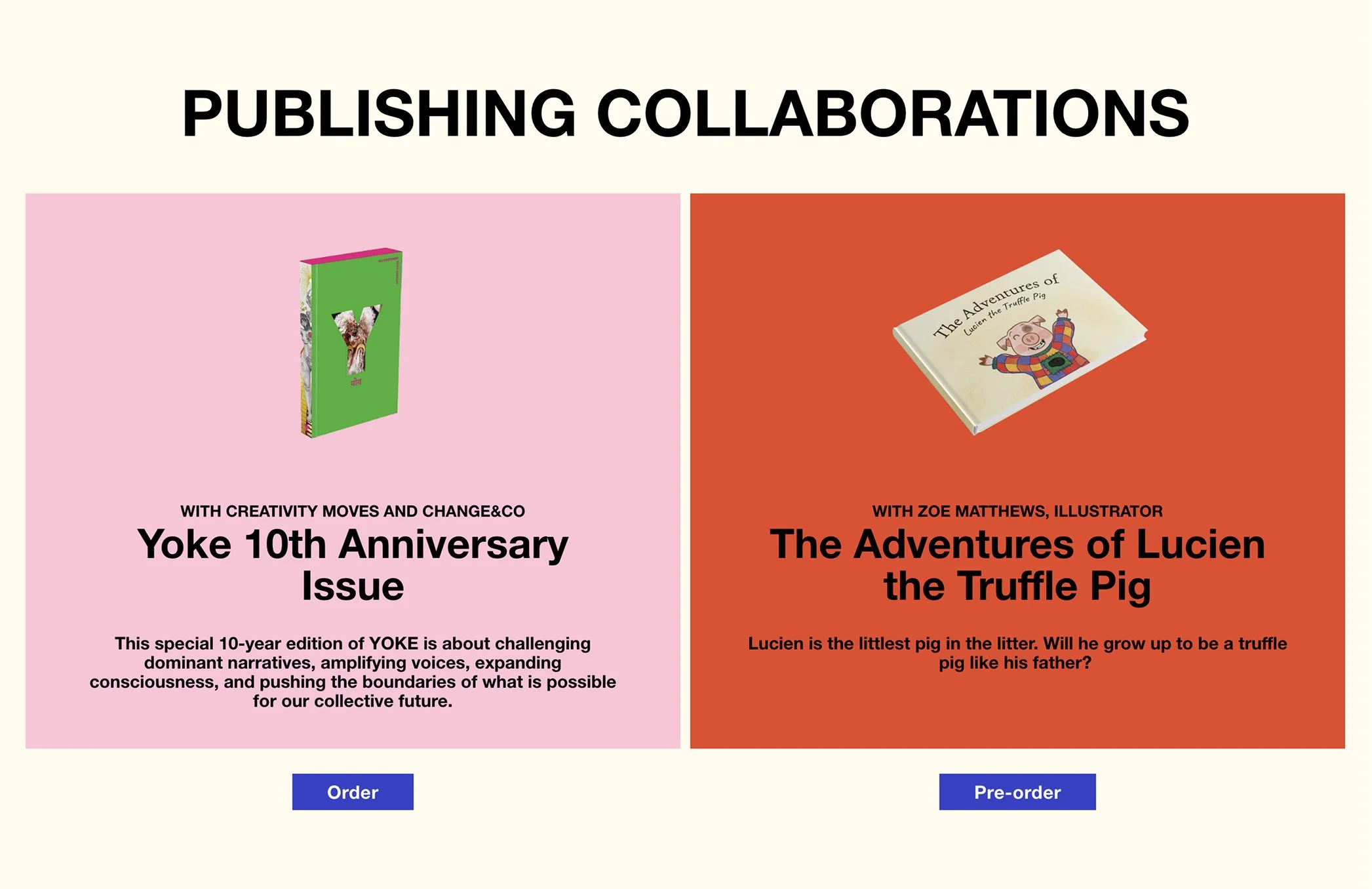
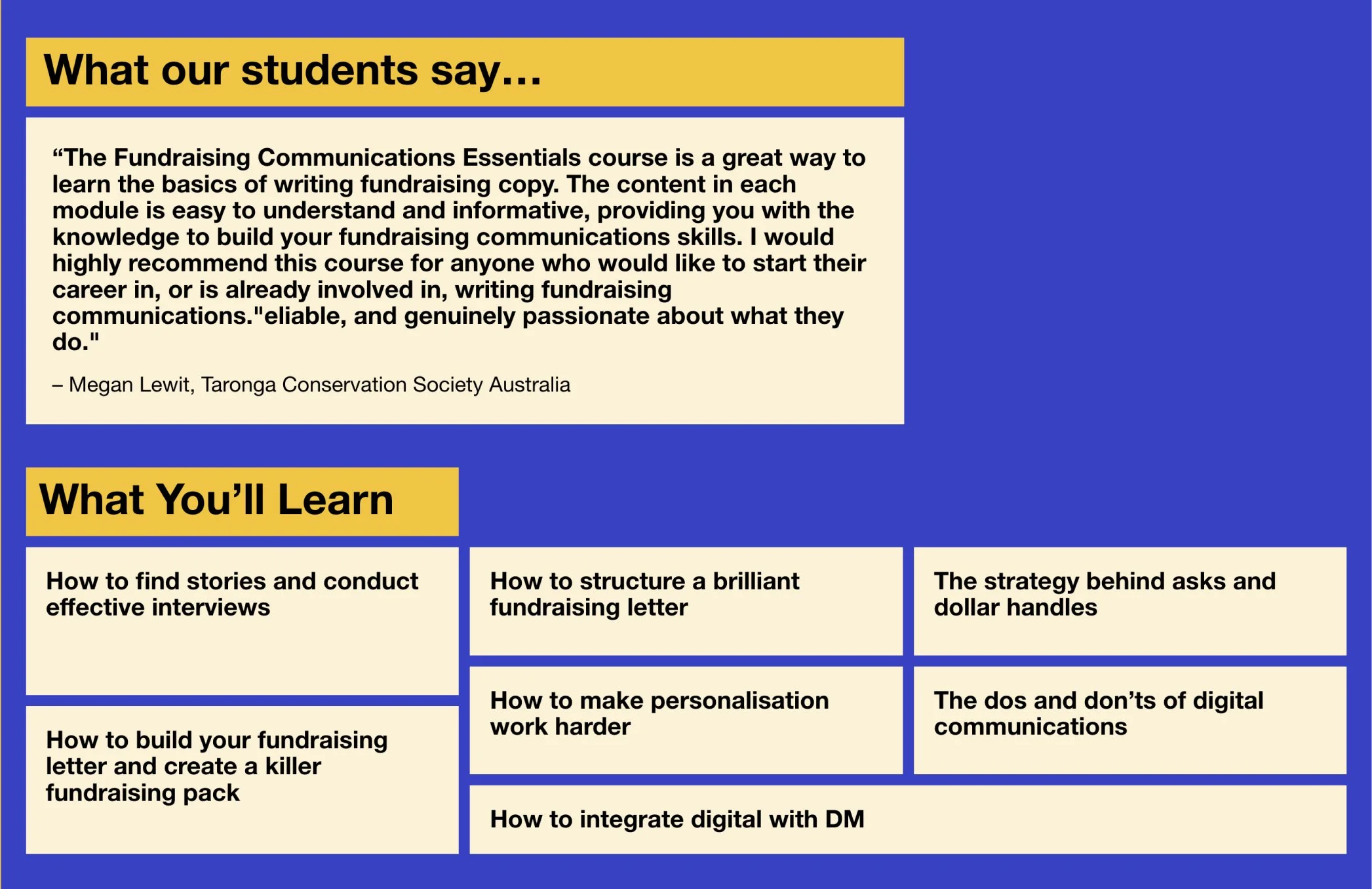
Courses
Dominique is packaging years of teaching expertise into structured online learning. We designed these as self-contained experiences within Squarespace, giving her full control over enrolment and content updates.
The course pages carry the Mondrian principle into interaction. Text descriptions sit alongside a call-to-action button set slightly askew, a modernist composition that's also functional. Hover, and the button snaps into alignment. Order emerges through participation, not prescription.
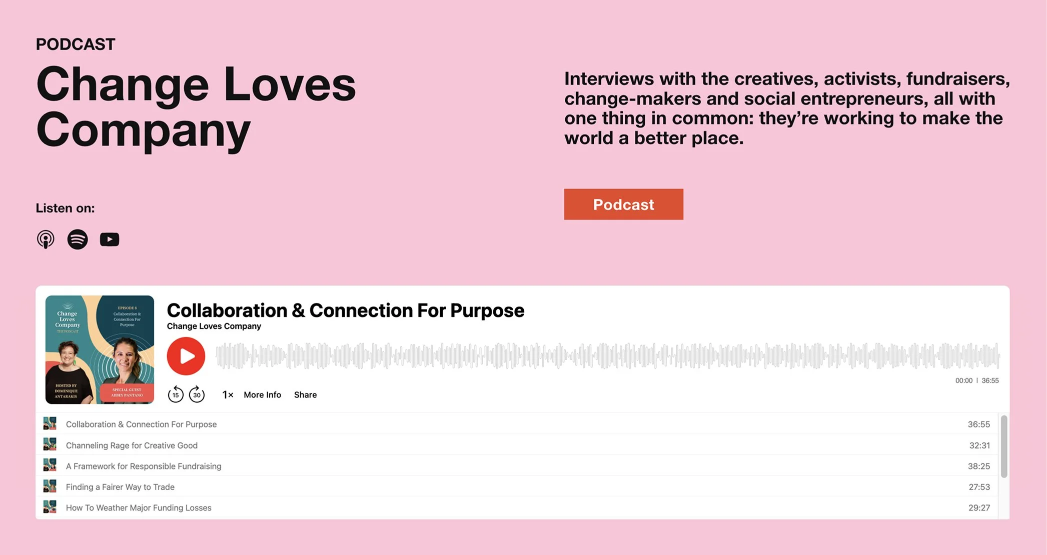
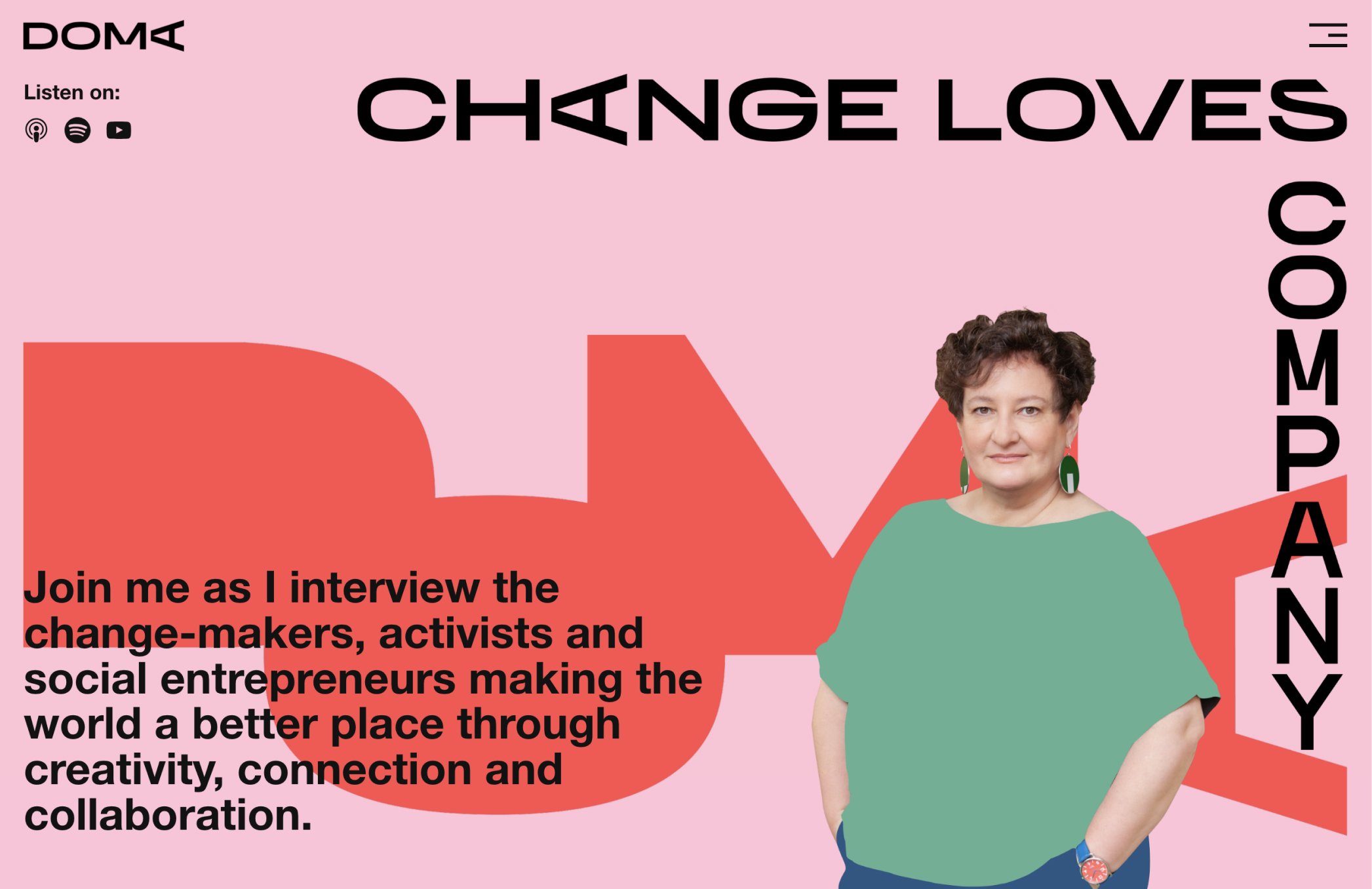
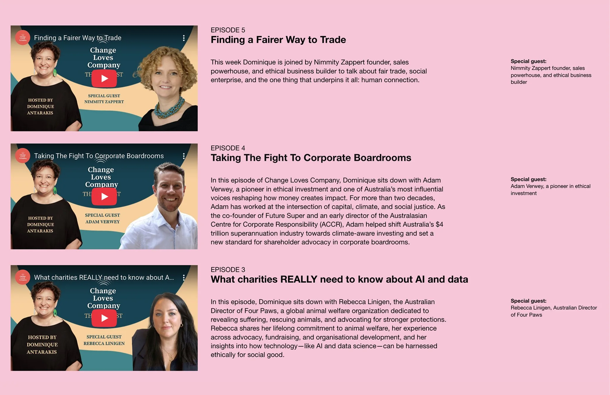
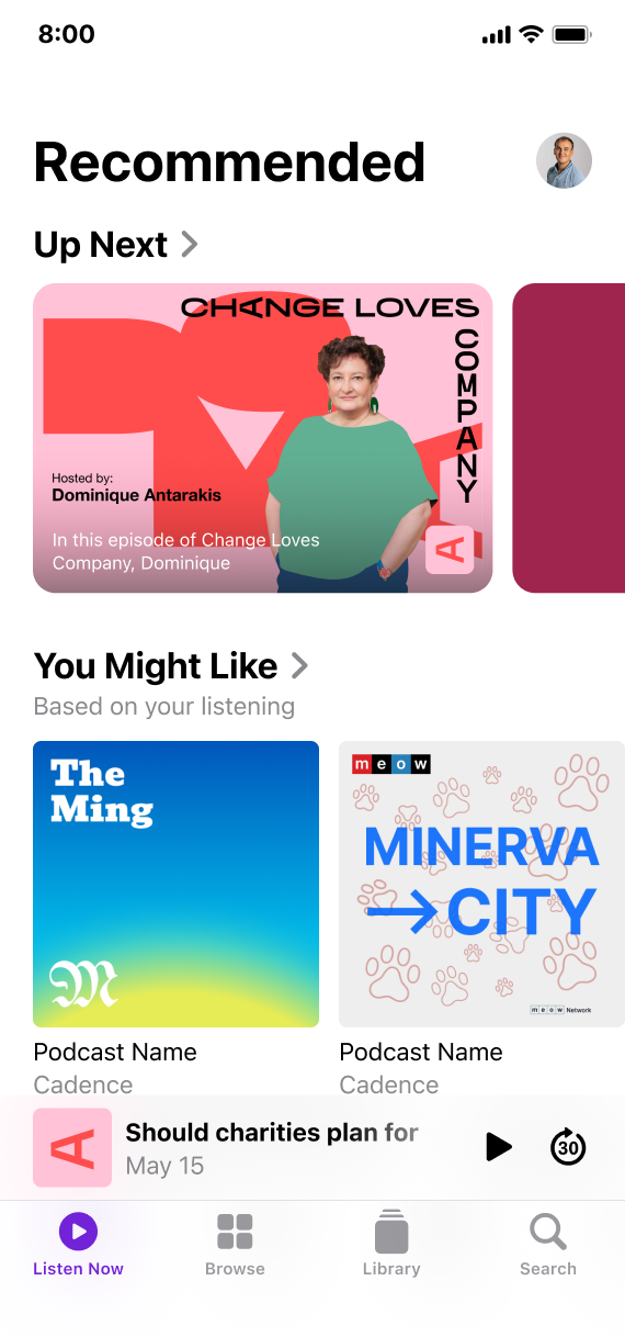
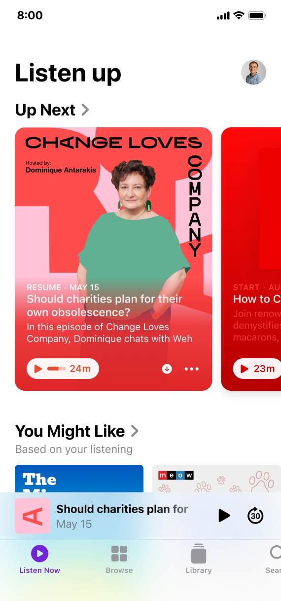
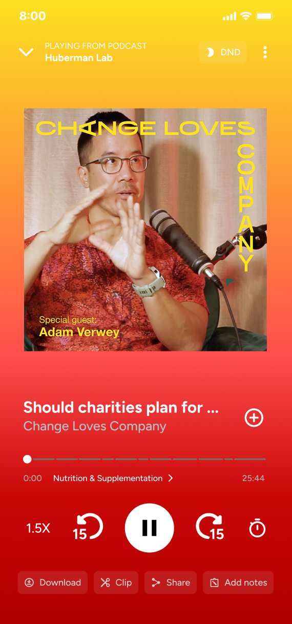
Podcast
We developed the full brand package for Change Loves Company: logo, identity, episode graphics. BRRR sets the podcast title along two edges, horizontal and vertical, forming a frame corner. The DOMA letters sit in the background at massive scale, reading as graphic shapes before you notice they're letters. A quiet production signature. Dominique's photo is posterized into clean graphic form.
Squarespace build
The vignettes lead to micro pages, each showing three panels: problem, solution, and result. Simple and clear. The homepage grid, the course pages, the podcast branding, the micro pages, all built on Squarespace, all maintainable by Dominique without developer support.
Results
The site does what a conventional consulting website couldn't: it shows that Dominique is many things at once, and has the audacity to be all of them.
"Denys is a web designer who is also an artist at heart. It was the first time I’d done a web project that felt like sitting to have my portrait painted. With just a few brushstrokes The Blue-Eyed Barbarian managed to capture the essence of what I was trying to communicate, leading to a playful, colourful, anti-corporate consulting site that is both elegant in its simplicity and complex enough to convey the many facets of my work at once.
The entire process was deceptively simple – Denys was endlessly patient, a true Sherpa guide whose calm demeanour and sense of humour made the experience almost entirely painless.
The new logo and podcast branding updates were an unexpected but very welcome addition to the project.
I would recommend The Blue-Eyed Barbarian for your next web project without hesitation."
— Dominique Antarakis