Alfred Hitchcock Estate
Translating cinematic principles into a digital experience for a legendary filmmaker's legacy
the blue-eyed barbarian:
Denys Putilin, Olena Kvitkovska
Sector:
Director’s Estate
Website:
alfredhitchcock.com
What we did:
Creative Direction
Website Design & Development
Year:
2024
Fonts:
Clarendon by Patrick Griffin
News Gothic
Geometric Slab Serif


Client and the challenge:
The Estate of Alfred Hitchcock needed a digital home that could serve two distinct audiences: fans seeking to explore the director's legacy, and potential licencing partners evaluating commercial collaborations. The existing website, built around movie posters and basic information, couldn't communicate the sophistication of Hitchcock's artistry or the commercial potential of his brand.
Approach:
We began by immersing ourselves in Hitchcock's world. Over several weeks, we watched his films, read biographies, and most importantly, studied François Truffaut's foundational book-length interview with the director, where film-by-film, they explore together Hitchcock's artistry, and techniques such as visual storytelling, narrative construction and manipulation of audience emotion using suspense. In America, Hitchcock is often remembered for his later, more commercial films. In France, he was recognized as an auteur and Truffaut, himself a French New Wave director, sees Hitchcock above all as a serious artist and craftsman.
From this research, a hypothesis emerged: Hitchcock's own approach would guide our own design principles. His methods for constructing suspense, rewarding his viewers through attention to detail, and blending the needs for both artistry and commercialism, became our guideposts.
Design principles:
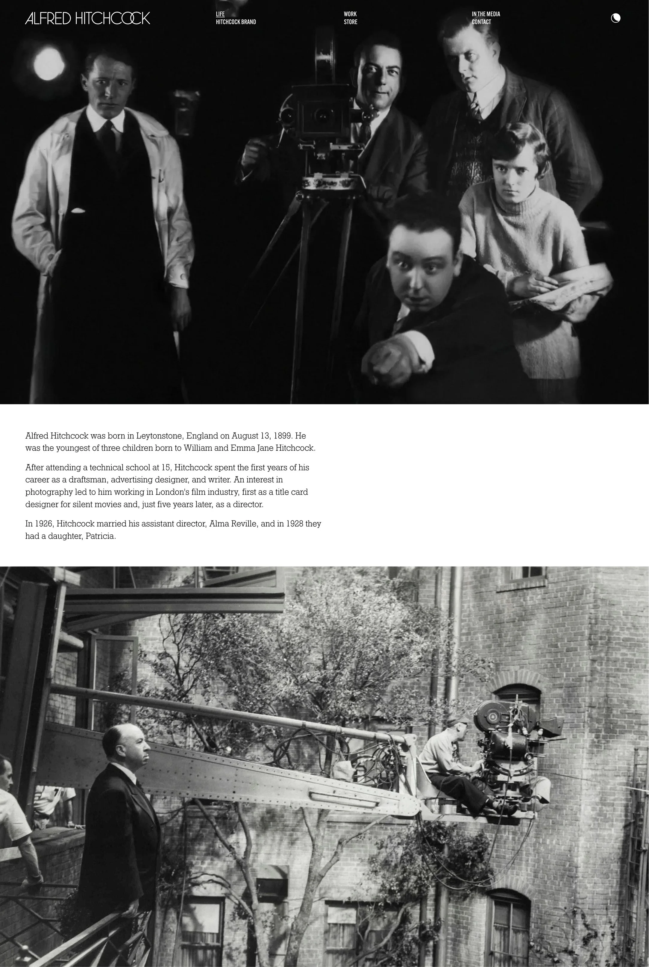
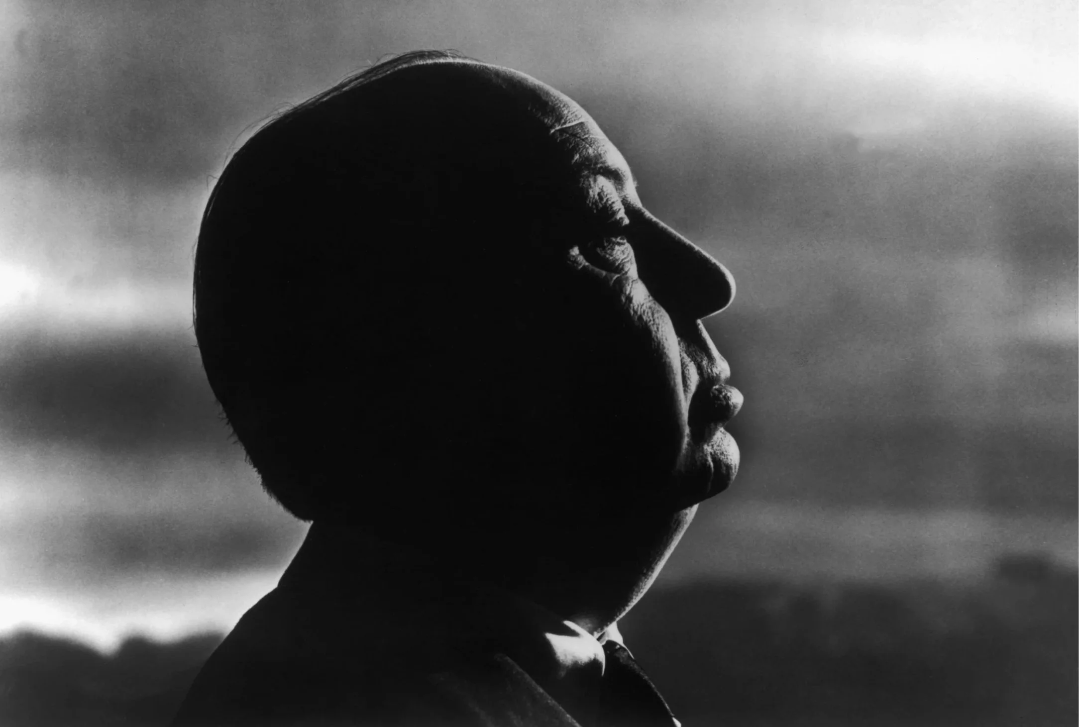
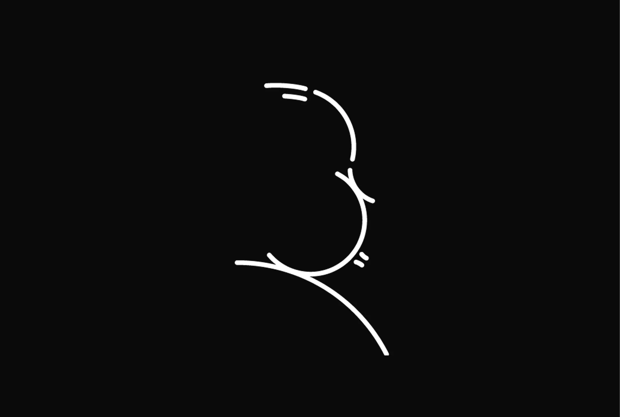
Classical without pretension. Hitchcock always ensured his characters were elegantly dressed, and every delivered word was considered. But he didn't take himself too seriously. He used dry humor in places you might not expect it. We applied these qualities in our image curation. The client encouraged us to use any available imagery we chose, from any source, be it public, paid, or private archive. We chose to select high-quality photographs where the elegance of his world is evident, alongside his playfully self-aware portraits. The site opens with his iconic profile - the silhouette he developed into a personal logo, transforming his own forehead, nose, and chin into a brand mark decades before personal branding existed.
Complex enough to intrigue, clear enough to follow. The site unfolds in large vignettes with generous white space. Visitors progressively discover the story in a controlled way, mirroring the way Hitchcock structured his own suspense. He famously locked the cinema doors to latecomers after the screening of Psycho began, to ensure his audience properly experienced his carefully engineered suspense and shock.
Hidden details reward curiosity. Hitchcock planted “Easter Eggs” throughout his films: his famous cameos or references to previous work. We embedded the same principle: clicking a still image in the filmography reveals the original poster. A "dark mode" switch bathes all images in red, nodding to the visual effect in Marnie. Footer quotes rotate on every page, giving unexpected glimpses of his dry humor.
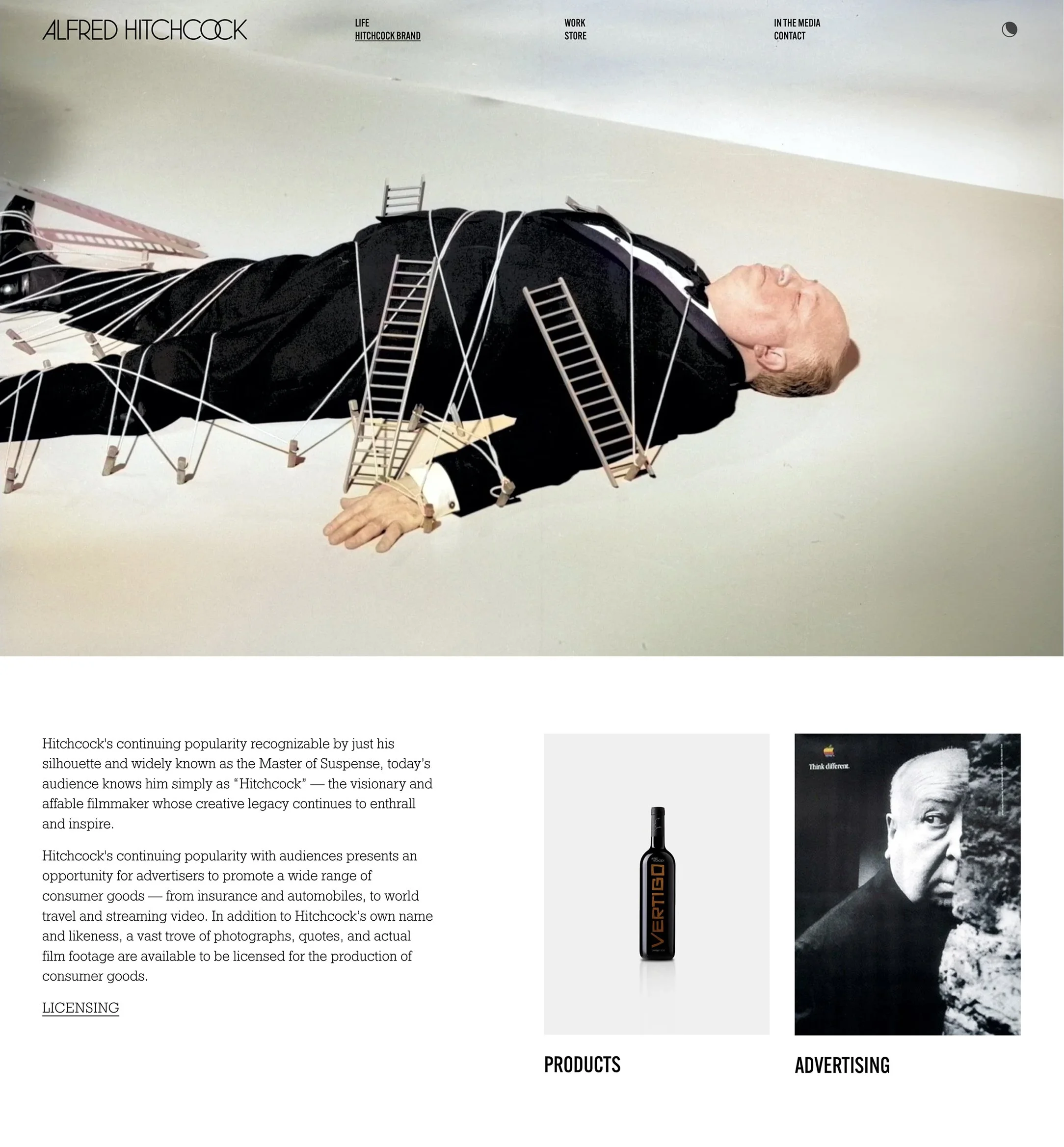
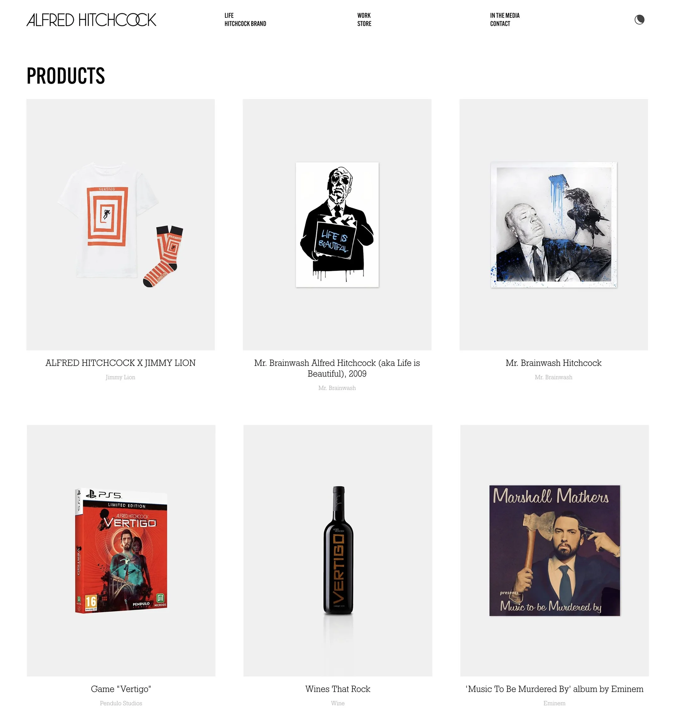
Unapologetically commercial. Hitchcock was an innovative marketer. For all his artistic quality, he unashamedly promoted his work, even allowing himself to become the face for his style. The site deliberately embraces this duality, blending artistic legacy and the need for promotion. A dedicated Brand section documents his media appearances and licencing history, signaling to potential collaborators how the Hitchcock brand functions in contemporary contexts.
Structure and content:
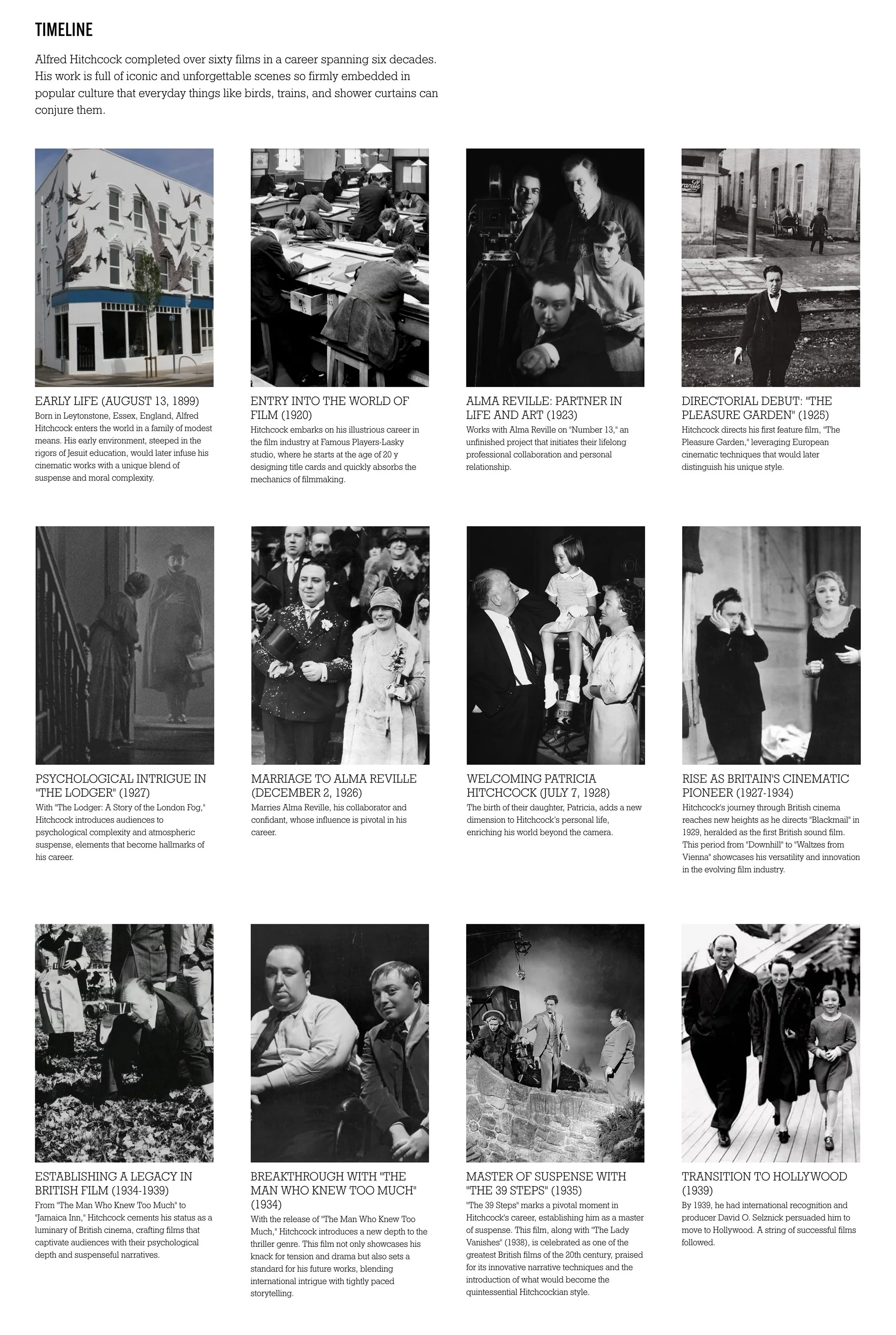
We proposed restructuring the site around four branches: Life, Work, In The Media, and Hitchcock Brand. The Life section is an exciting addition and acknowledges Alma Reville, his wife and critical creative partner. We sourced home footage and edited a video montage for the homepage. We also created a visual timeline using insights from our own biographical research.
Typography:
We chose to set the tone of the site by using Clarendon and News Gothic, the two typefaces used in the Vertigo's iconic opening credits. We picked Geometric Slab Serif for the body text as a nod to mid-century movie scripts, allowing us also to optimize for screen readability.
Squarespace build:
We prioritized native Squarespace tools wherever possible, ensuring the Estate can maintain the site without any support. The exception was the dark mode. A simple red overlay wouldn't do. We wanted cinematic red pigmentation, the way Marnie actually looks on screen. We used custom code so we could apply a filter across images and videos and create navigation that distinguished the site from typical Squarespace templates.
Results:
The project tested a hypothesis: that a subject's own artistic principles could become a design framework. The site doesn't explain Hitchcock; it behaves like him. It withholds and reveals. It rewards curiosity. It balances elegance with dark humor. Whether this approach translates to other legacy projects remains to be seen, but for the Alfred Hitchcock Estate, the method held.
“When we decided to completely re-imagine the website for the Estate of Alfred Hitchcock, it was critically important that we balanced meeting the elegant content and tone expectation of his established fan base, while also designing something modern and contemporary that would appeal to younger fans. Thankfully, we found Denys and his team.
Denys did a deep dive into Hitchcock to completely and comprehensibly understand both his career and his impact on pop culture and his place in the history of filmmaking.
While we had some general parameters of what we wanted to accomplish, Denys drove the creative process, suggesting quite a few innovative design ideas that elevated the Hitchcock brand. The iterative process of design and implementation was simple and clear. Denys was very responsive and happy to engage and debate to ensure we arrived at the best possible decisions that best served the Hitchcock brand.
The end result was a beautifully imagined, designed and rendered site that allowed us to move from a static series of web pages to a site that feels like a dynamic representation of one of the greatest contributors to modern filmmaking.”
– David Reeder